UI/UX Design · Branding · 2025
Empowering local urban farmers.
Pluck some produce into the phone
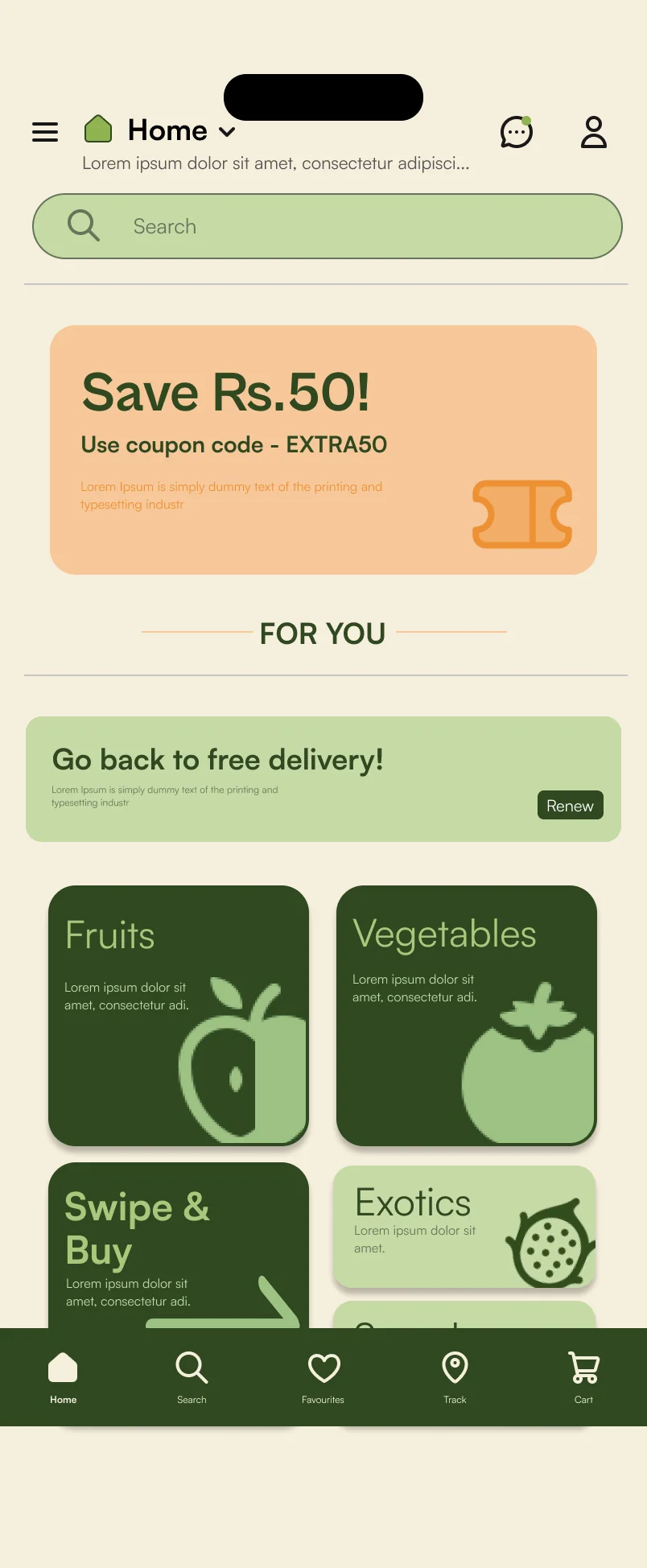
Organic Terrace Garden (OTG) farmers in RR Nagar, Bangalore, grow more organic produce than they can sell, and they sell it through WhatsApp groups. DESiPLUCK gives them a proper shop: customers buy, farmers sell, and college students deliver.
04- My role
- Research, connecting with the OTG farmers, live chat and mini-game flows, card sorting, wireframes, the logo and branding, the prototype, every deck, and the Behance case study and its animations
- Team
- Aditya Vellal (me), Chinmaya M Hebbale, Dhwani Aggarwal, Harshini Chander, Adithya Sridhar
- Course
- UI/UX and Advanced UI/UX
- Time
- Two semesters: research first, then branding, screens and the prototype
What this project covered?
- User research
- Interviews
- Questionnaire
- Competitor research
- Personas
- MoSCoW
- Concept evaluation
- Card sorting
- Information architecture
- User flows
- Wireframes
- Branding
- UI design
- Prototyping
- Usability testing
- Motion
The problem.
A group of Organic Terrace Garden (OTG) farmers in RR Nagar produce fresh organic produce every day and already have a good customer base, but they don't have an organised, dedicated platform to sell it.
They sell through a WhatsApp group, though they grow enough for at least 10× the customers they reach today. Here's how a morning in that group goes, replayed from real messages with names hidden.
- Farmer 1Karpooravalli banana, organically ripened on the tree!
- Farmer 2Looks awesome
- Farmer 2Copra available, 300 per kg
- Ragi powder, 110 per kg
- Customer 1I need 5 kgs pls
- Where to pick?
- Customer 2Keep half kg for me please, I'll try to collect today or Friday
- Farmer 1📍 Shared a location
- Farmer 3
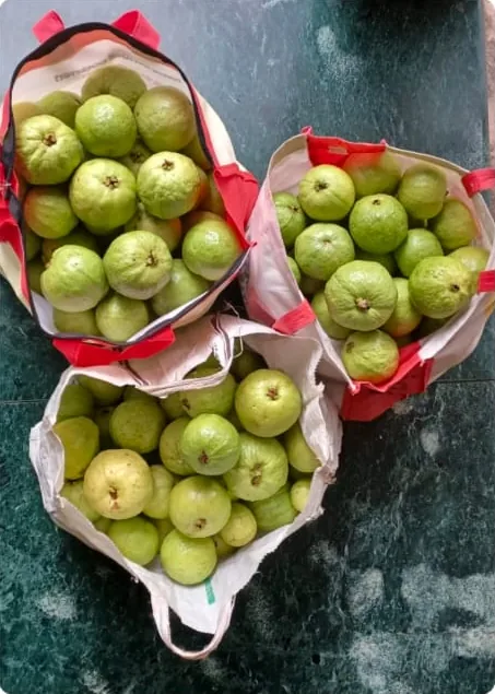 Dear all, I've brought over a few kgs of guavas just now. Pls let me know if you are interested. They can be picked up anytime this evening or tomorrow.
- Customer 1Yes, 3 kgs for me pls
- Farmer 3Thanks. I'll keep them aside for you
- Customer 3Pls share address sir
- Customer 43 kgs for me please. Thanks
- Farmer 3Will do
What the chat shows
Real messages from one group of farmers and their customers in September 2024. Names and numbers are hidden; each person keeps the same number throughout.
Choosing the problem.
We researched four problems around us before picking one. Tap through them.
Waste collection
- Market
- Bangalore generates an estimated 5,000–6,000 tons of waste a day, and it keeps growing with the city.
- Who
- 25–60, middle to upper-middle class, busy urban families and professionals.
- Pain points
- Irregular collection times
- Overflowing waste
- Pests and health risks
- Foul odours
- Managing waste themselves
A crowded pizza place
- Market
- A fast-growing residential and commercial area, with the metro on its way.
- Who
- 18–45, middle to upper-middle class, tech-savvy and social.
- Pain points
- Not enough seating at Pizza Therapy
Commercial printing
- Market
- India's commercial printing market: US$34.5 billion in 2023, expected to reach US$45.3 billion by 2032 (IMARC Group).
- Who
- 20–60, business owners and corporate clients in cities and towns.
- Pain points
- Finding an experienced, skilled designer
- Lack of storage
Organic Terrace Garden farmersPicked
- Market
- Our estimate: ₹30–180 million a year, with 10–20% growth a year as organic food and terrace gardening grow.
- Who
- Part-time OTG farmers, 35–45, post-graduates in Bangalore.
- Pain points
- Selling the produce
- It's perishable
- A very short shelf life
- Explaining why organic is worth it
- Reaching everyone who wants organic
A real community we could talk to (I knew the farmers), a problem they live with every day, and enough produce for 10× their customers.
From our market research deck (problems 1–4). The OTG market size and growth are the team's own estimates, and the 10× comes from what the farmers told us; neither was independently verified.
The research.
Three questions, in this order: who already does this, what do the farmers actually need, and who exactly are we designing for.
What's out there
Four platforms that connect farmers to buyers, in India and abroad.
What the farmers said
A questionnaire for the farmers in the group, then live interviews.
Who we design for
Three personas, built from those answers.
What's out there
Pluckk came closest: it serves the same urban, health-conscious buyers and also wants to connect producers directly with consumers.
 PluckkBangalore and Mumbai · closest competitor
What they do wellFresh, high-quality produce, meal kits and eco-friendly practices.
Where they fall shortPricier than conventional produce, limited distribution areas.
 KisanKonnectMumbai, Pune, Shrirampur
What they do wellDirect farmer connection, no middlemen, fair pricing for farmers.
Where they fall shortDelivery delays, product availability, quality inconsistency.
 FarmdropUnited Kingdom
What they do wellDirect farm-to-consumer, flexible ordering, ethical supply chain.
Where they fall shortLimited reach, price premium, delivery logistics.
 Farmbox DirectContinental US
What they do wellOrganic focus, customisable boxes, no long-term contract.
Where they fall shortLimited variety, inconsistent freshness, inflexible subscriptions.
Every one of them moves produce from farms far away to buyers who never meet the grower. None is built for a farmer selling to her own neighbourhood, or lets a buyer ask the person who grew it. That gap is where DESiPLUCK sits.
What the farmers told us
A short questionnaire with farmers from the group, then live interviews. Only two or three farmers answered each question, so read these as conversation starters, not statistics.
100%Both asked for help with delivery
Delivery, not growing, is the bottleneck.
66.7%Mostly to people they already know
- Directly to friends, family and neighbours66.7%
- Online platforms33.3%
100%Talking to customers directly
- Direct communication with customers100%
This became the live chat.
100%All of them want to grow
100%Health first
Who we design for
Three OTG farmers, drawn from the questionnaire and the interviews. Each one pushed a feature onto the list.
Grow healthy produce, sell the surplus, and one day farm full-time.
Pain pointsTransport and delivery logistics. Not happy with her current selling platform. Hard to market and reach a bigger audience.
- Expand production
- A larger customer base
- Become a full-time OTG farmer
Get genuine, chemical-free produce to the masses, and teach people why it matters.
Pain pointsGetting the right value for the investment. Reaching enough customers. Transport. Competition. People care more about looks than quality.
- A chemical-free lifestyle
- Food from trustworthy sources
- Everyone eating genuine food
Sell locally, with a direct connection to her customers.
Pain pointsNo access to buyers or platforms. Little marketing or technical know-how. Not enough skilled labour.
- Environmental sustainability
- Community and cooperative support
- Higher visibility
Defining it.
Everything the farmers asked for, sorted with MoSCoW. The must-haves were the requests we heard again and again in the questionnaire and the interviews.
1Must have
3- Delivery assistance
- Better marketing
- Availability of produce
2Should have
3- Nutritional value info
- Price comparison between sellers
- Live chat with customers
3Could have
3- Recipes
- Ways to retain freshness
- Suggestions to group items
4Won't have
3- Inorganic produce
- Unreasonable prices
- Poor customer service
Due to poor marketing and the lack of a dedicated platform, a group of part-time OTG farmers residing in RR Nagar are not able to sell as much as they're capable of.
Our solution-neutral problem statement: it names the people and the pain, and doesn't suggest an answer, so we stayed open to any way of solving it.
What matters most.
We turned the list into twelve requirements and compared every one against every other: 1 if it mattered more, 0.5 if the same, 0 if less. Adding up each row gave its score. 8 and above became a demand, 7 to 8 a wish.
Wild ideas, then one.
For each demand we went wide three ways: a brainstorm, a mind map and a sketch storm. Some ideas were sensible, some were not, and that was the point.
Delivery assistance
- Tie up with delivery apps (Dunzo)
- Recruit college students in the area
- Doorstep delivery or self pickup
- Drones, robots, a helicopter, a slingshot, a Tesla Cybertruck
Best value
- List every price point
- Place products next to each other
- A stock-market style price chart
- Justify the price
- Tasting samples
Communication
- Live chat
- FAQs and an AI chatbot
- A call centre
- Telepathy, Neuralink, a pigeon or the postman
Increased sales
- Suggest items that go together
- Recipes and exotic picks
- Spin the wheel, reward points, mini-games
- A dating-app style interface
- Live process videos
Buckets and concepts.
Then idea bucketing: one idea from each demand, picked from any of the three techniques, makes a concept. R1B2 means demand 1, brainstorm idea 2. We made ten.
To score them we gave each demand a weight, its share of the four demand scores added together (35.5):
- 0.26Best value (9.5 ÷ 35.5)
- 0.25Delivery assistance (9 ÷ 35.5)
- 0.23Communication (8.5 ÷ 35.5)
- 0.23Increased sales (8.5 ÷ 35.5)
Each idea was rated against its demand, 0, 0.5 or 1, and multiplied by that weight. Pick a concept to see how it adds up.
Concept C1
Weighted total0.725
- Delivery assistanceCollege students1 × 0.25 = 0.25
- Best valueTasting samples0.5 × 0.26 = 0.13
- CommunicationLive chat1 × 0.23 = 0.23
- Increased salesProcess videos0.5 × 0.23 = 0.115
Concept C2
Weighted total0.73
- Delivery assistanceDelivery apps0.5 × 0.25 = 0.125
- Best valueListing items1 × 0.26 = 0.26
- CommunicationAI chatbot0.5 × 0.23 = 0.115
- Increased salesSpin the wheel1 × 0.23 = 0.23
Concept C3
Weighted total0.59
- Delivery assistanceDrone0 × 0.25 = 0
- Best valueVideos that justify the price0.5 × 0.26 = 0.13
- CommunicationLive chat1 × 0.23 = 0.23
- Increased salesDating-app style interface1 × 0.23 = 0.23
Concept C4
Weighted total0.24
- Delivery assistanceDelivery apps0.5 × 0.25 = 0.125
- Best valueJustify the price0 × 0.26 = 0
- CommunicationAI chatbot0.5 × 0.23 = 0.115
- Increased salesRecommend exotics0 × 0.23 = 0
Concept C5
Weighted total0.725
- Delivery assistanceCollege students1 × 0.25 = 0.25
- Best valueTasting samples0.5 × 0.26 = 0.13
- CommunicationLive chat1 × 0.23 = 0.23
- Increased salesGroup complementary items0.5 × 0.23 = 0.115
Concept C6
Weighted total0.605
- Delivery assistanceDrone0 × 0.25 = 0
- Best valueList prices1 × 0.26 = 0.26
- CommunicationAI chatbot0.5 × 0.23 = 0.115
- Increased salesDating-app style interface1 × 0.23 = 0.23
Concept C7Chosen
Weighted total0.84
- Delivery assistanceCollege students1 × 0.25 = 0.25
- Best valueTasting samples0.5 × 0.26 = 0.13
- CommunicationLive chat1 × 0.23 = 0.23
- Increased salesSpin-the-wheel rewards1 × 0.23 = 0.23
Concept C8
Weighted total0.495
- Delivery assistanceCollege students1 × 0.25 = 0.25
- Best valueTasting samples0.5 × 0.26 = 0.13
- CommunicationFAQs0 × 0.23 = 0
- Increased salesLoyalty and reward points0.5 × 0.23 = 0.115
Concept C9
Weighted total0.715
- Delivery assistanceDelivery apps0.5 × 0.25 = 0.125
- Best valueStock-market style chart0.5 × 0.26 = 0.13
- CommunicationAI chatbot1 × 0.23 = 0.23
- Increased salesDating-app style interface1 × 0.23 = 0.23
Concept C10
Weighted total0.74
- Delivery assistanceCollege students1 × 0.25 = 0.25
- Best valueList prices1 × 0.26 = 0.26
- CommunicationLive chat1 × 0.23 = 0.23
- Increased salesProcess videos0 × 0.23 = 0
Ratings and totals from our concept evaluation matrix. C7 won with 0.84; the dating-app style swipe came along too, as Swipe & Buy.
User flows.
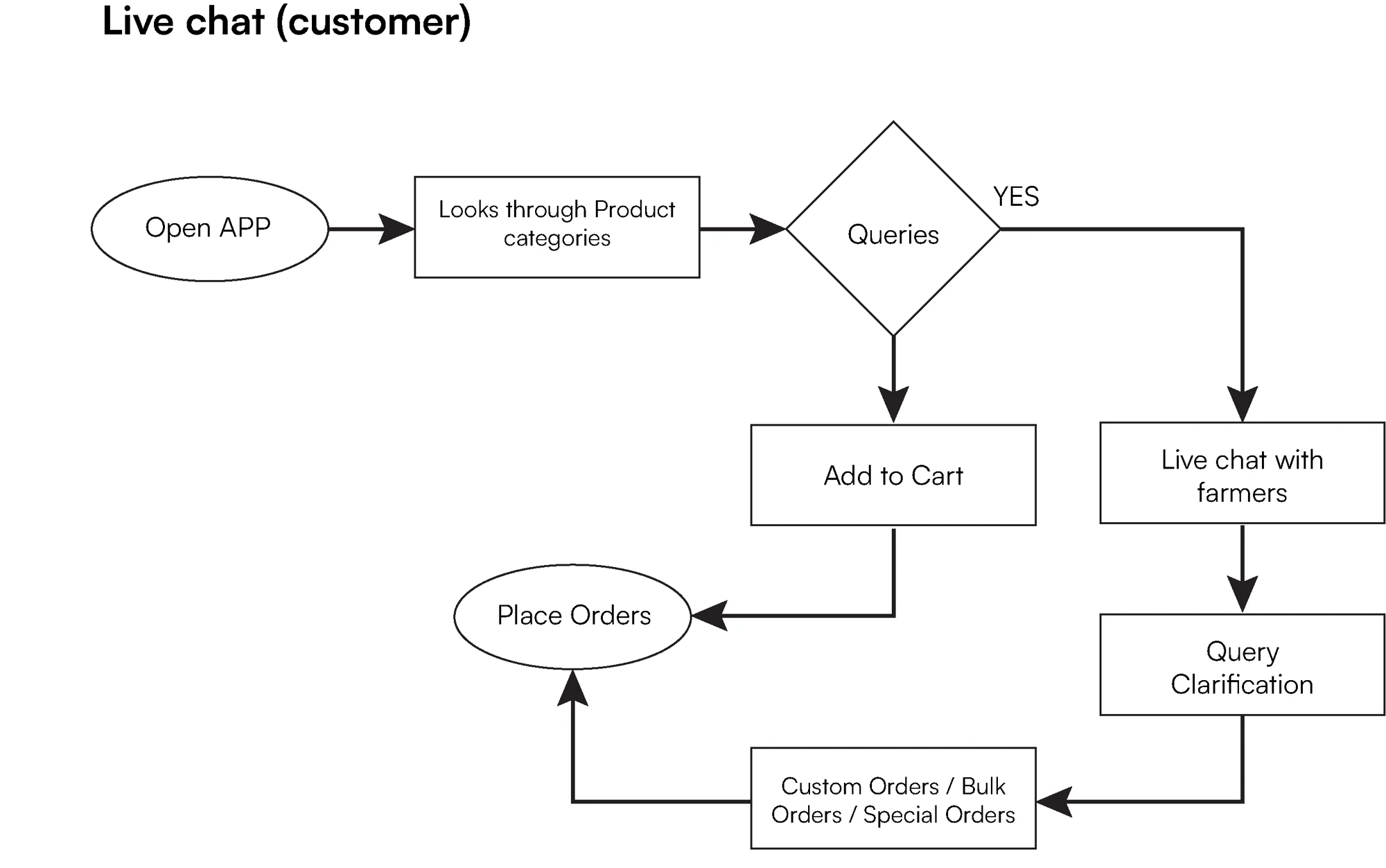
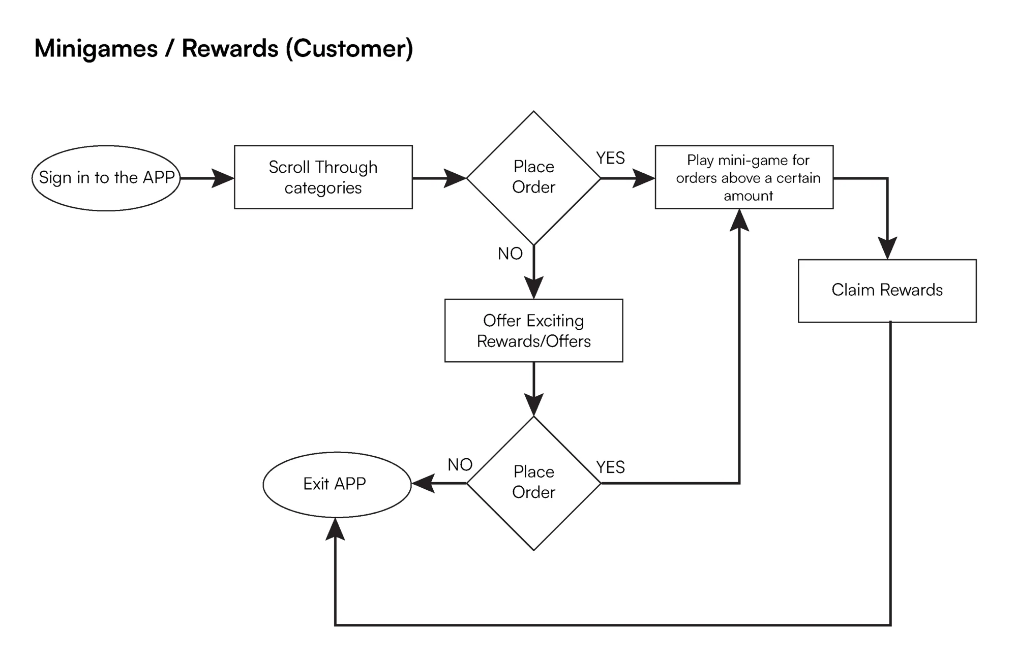
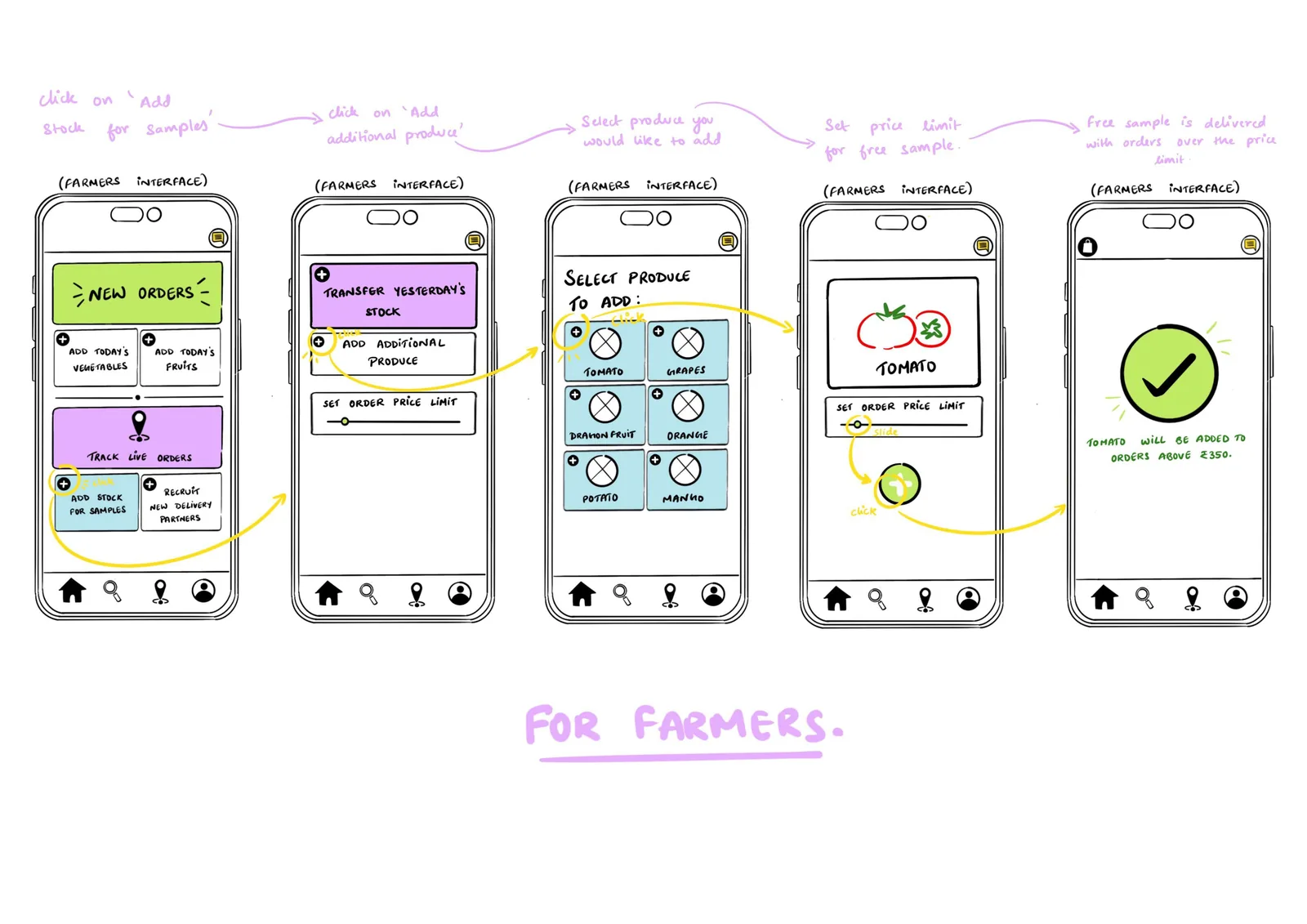
We split the features between us. Mine were the live chat, for customers and for farmers, and the mini-games and rewards.
Giving it a structure.
We listed every piece of content the app could have, audited it down to what earned a place, and simplified the labels people would actually see.
40 Content inventory
Everything the app could hold.
- Previous notifications
- Home page
- Offers
- Fruits and vegetables
- Price listing
- Distance comparison
- Reviews and ratings
- Description
- Live chat
- Customer support
- Cart
- Payment gateway
- Coupons
- Payment details
- Suggestions
- Profile
- Login and sign-up
- Past orders
- Gift cards
- Refer a friend
- Mini games
- Swipe and Buy
- FAQs
- AI chatbot
- Order now
- Samples
- Combos
- Exotic fruits
- Season specials
- Clearance sale
- Delivery
- Recruit students
- Assign a delivery
- Place delivery
- Track your order
- Far locations
- Self pickup
- Customise orders
- Bulk orders
- Gift hampers
13 Content audit
What earned its place.
- Home page
- Live chat
- Profile
- Cart
- Mini games
- Swipe and Buy
- Order now
- Delivery
- Customise
- AI chatbot
- Payment gateway
- Login and sign-up
- Customer support
6 Labels
What people see in the menu.
- Home
- My Profile
- My Cart
- Orders
- Live Support
- Delivery
Card sorting
We card-sorted 23 cards with real people to see how they'd group things. I ran four of the sessions: two part-time farmers (49 and 47), a 79-year-old who walks every day, and a 12-year-old.
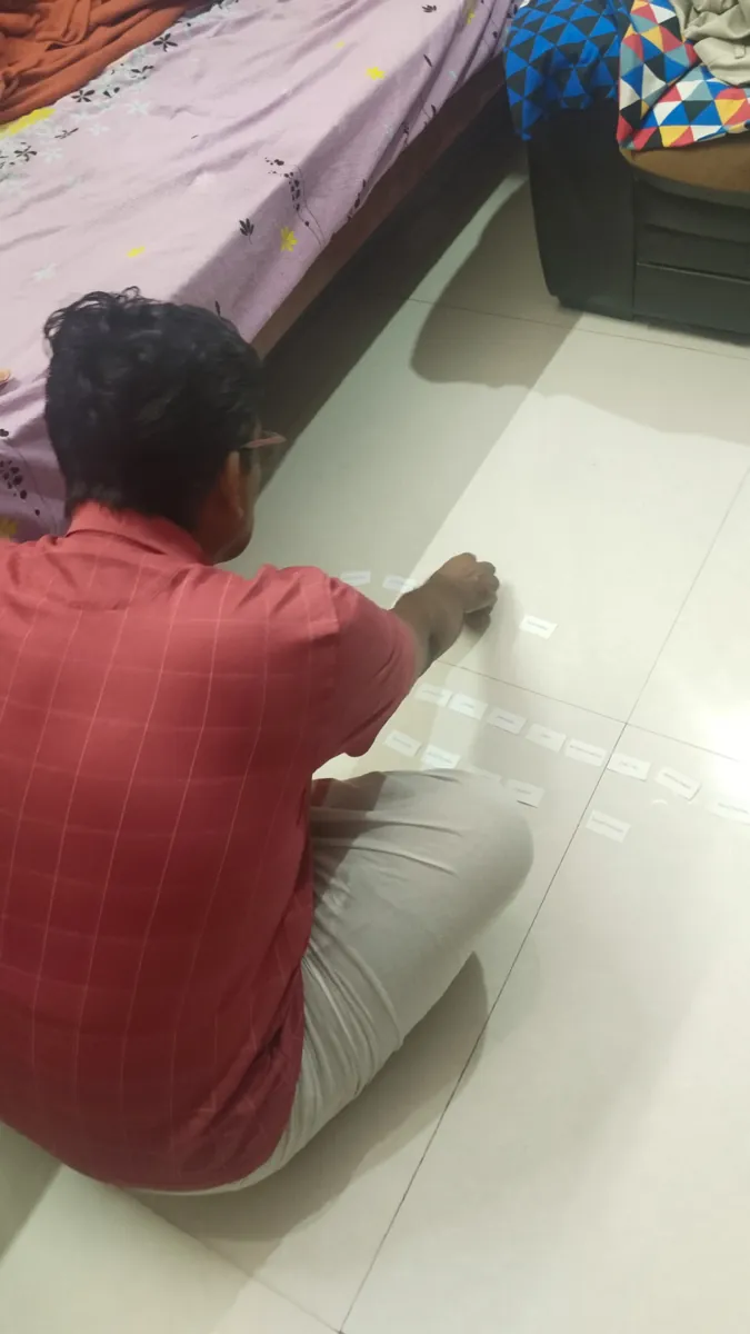
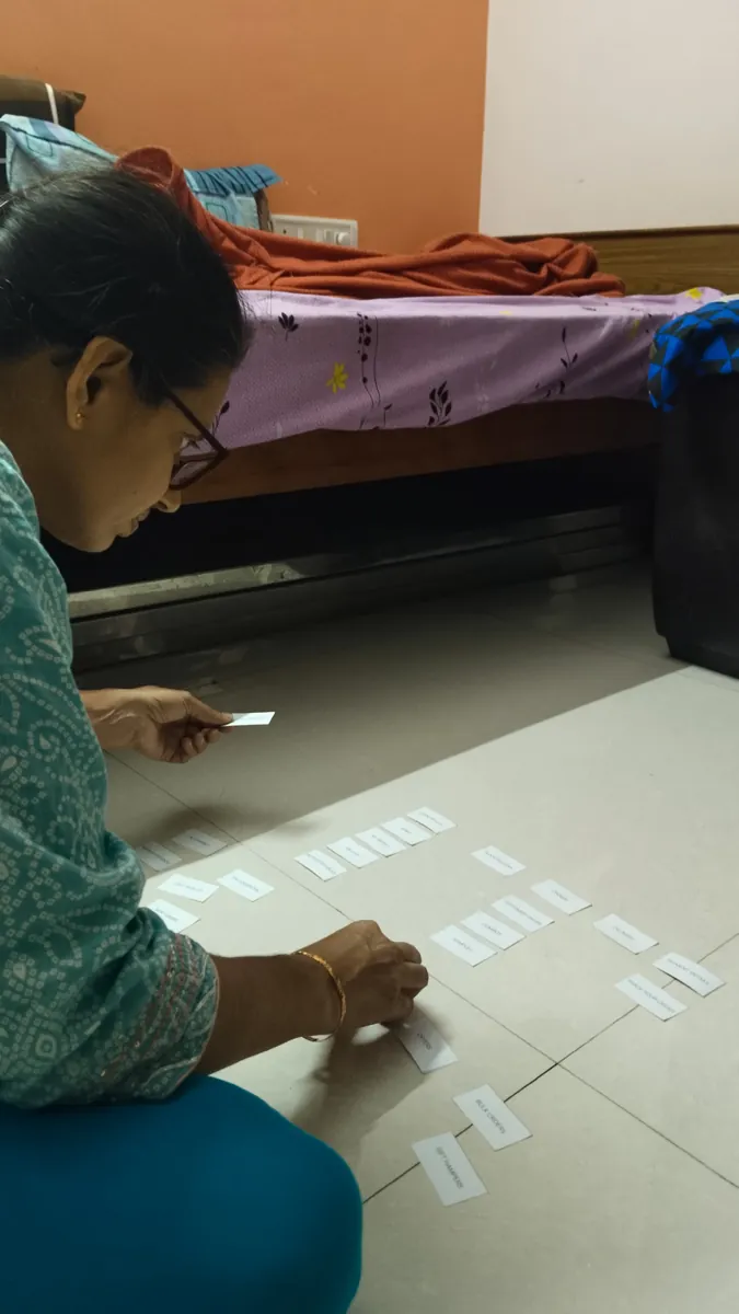
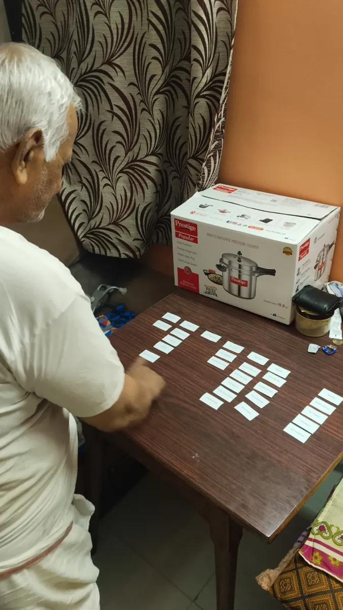
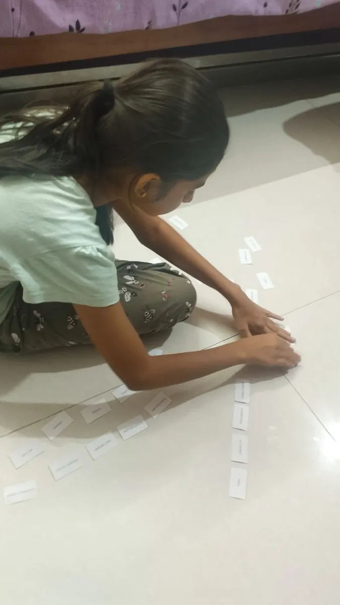
One farmer grouped the cards the way apps he already used do; another re-sorted hers after realising she'd mixed up two category labels.
The sitemap
- Login / Sign up
- Mini games
- Swipe & Buy
- Live chat
My Profile
- Login / Sign up
- Payment details
- Previous orders
- Refer a friend
- Gift cards
My Cart
- Coupon codes
- Offers
- Suggestions
- Payment gateway
- Payment details
Order
- Suggestions
- Favourite locations
- Customise
- Bulk order
- Gift hamper
- Swipe & Buy
- Fruits & vegetables
- Combos
- Coupons
- Track order
Help
- Live chat
- AI chatbot
- FAQs
DeliveryOTG farmer
- Recruit new students
- Find available students
- Assign a delivery
DeliveryStudent partner
- Join as a delivery partner
- Find orders nearby
Low-fi wireframes.
Mine first: the live chat and the spin-the-wheel flows as digital wireframes.
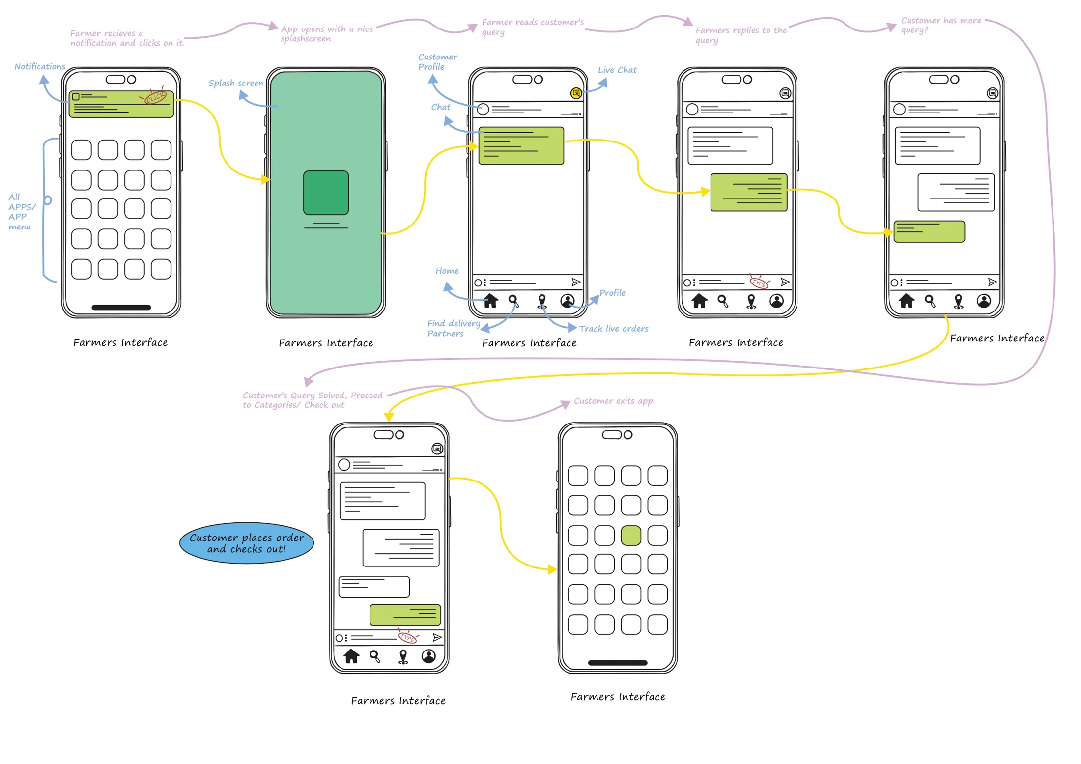
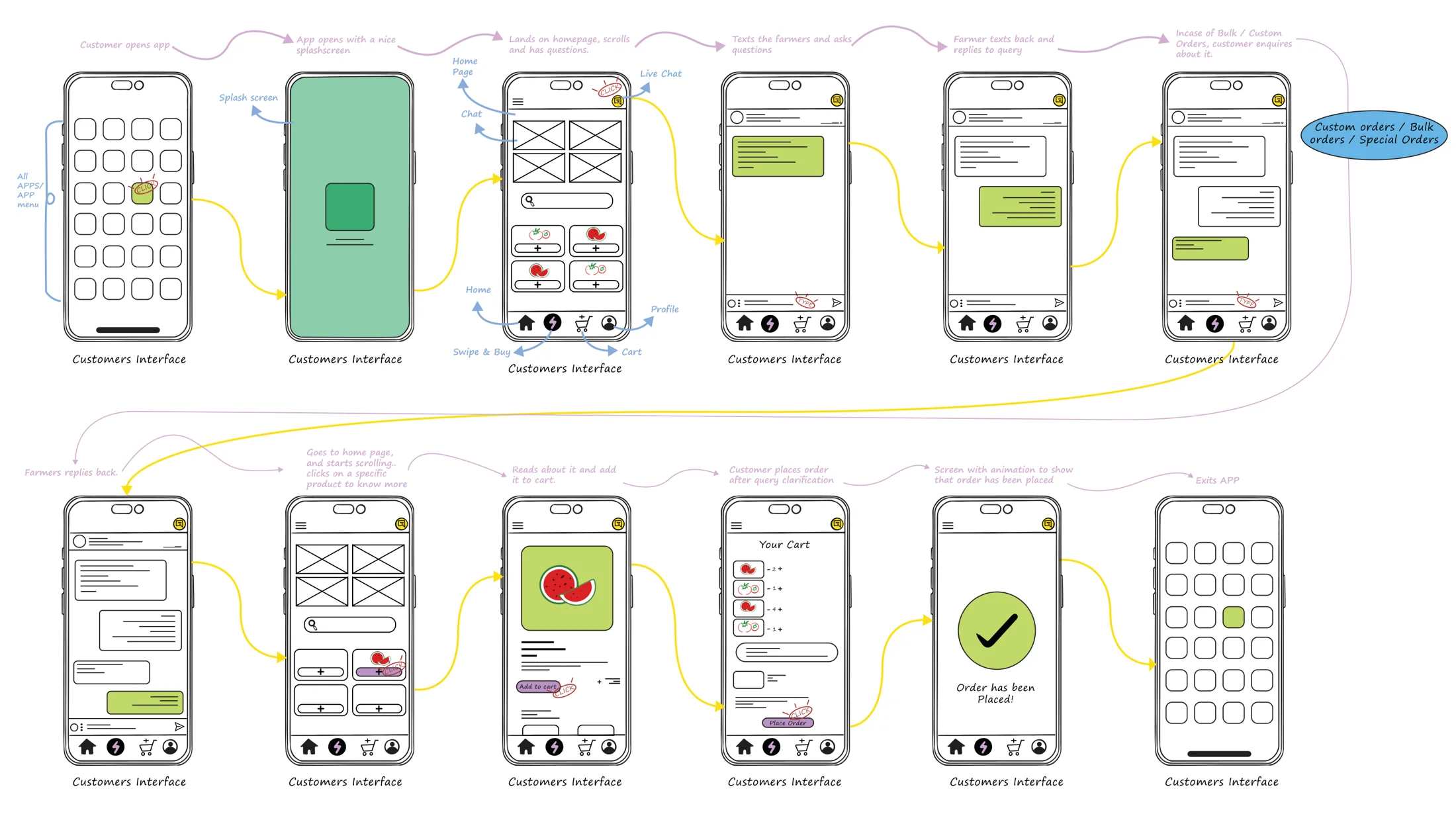
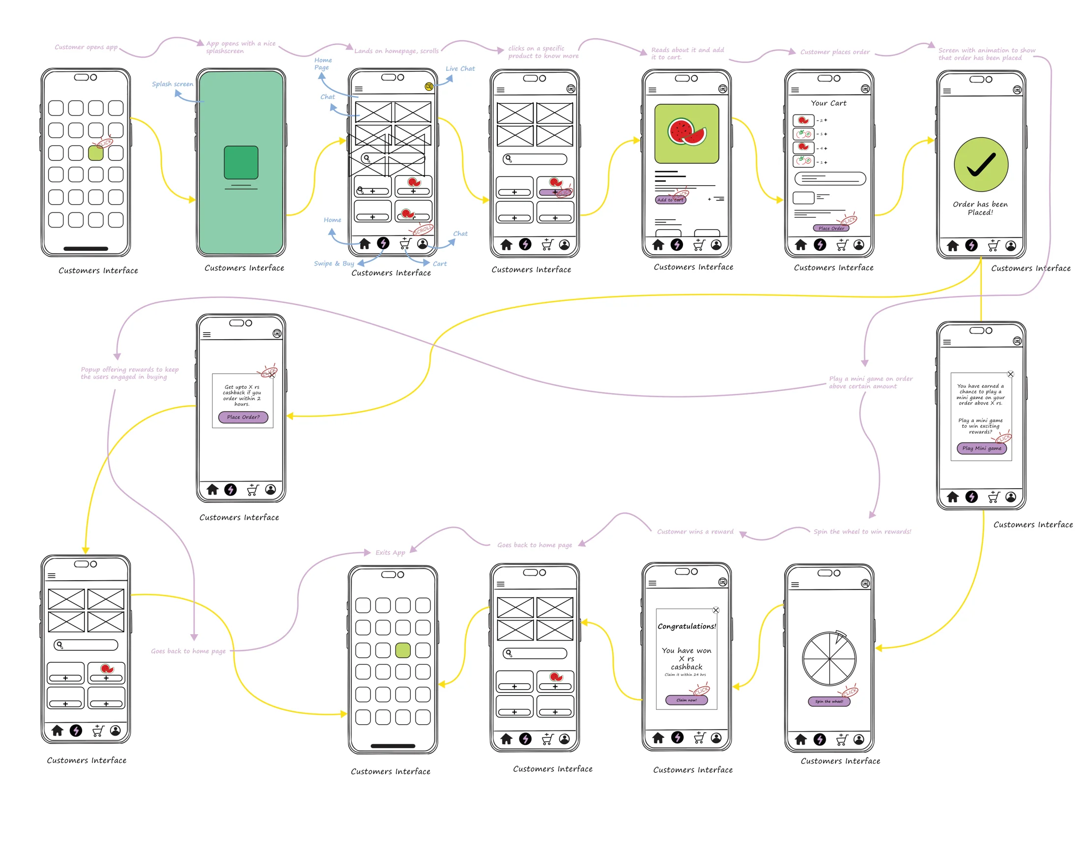
The team's
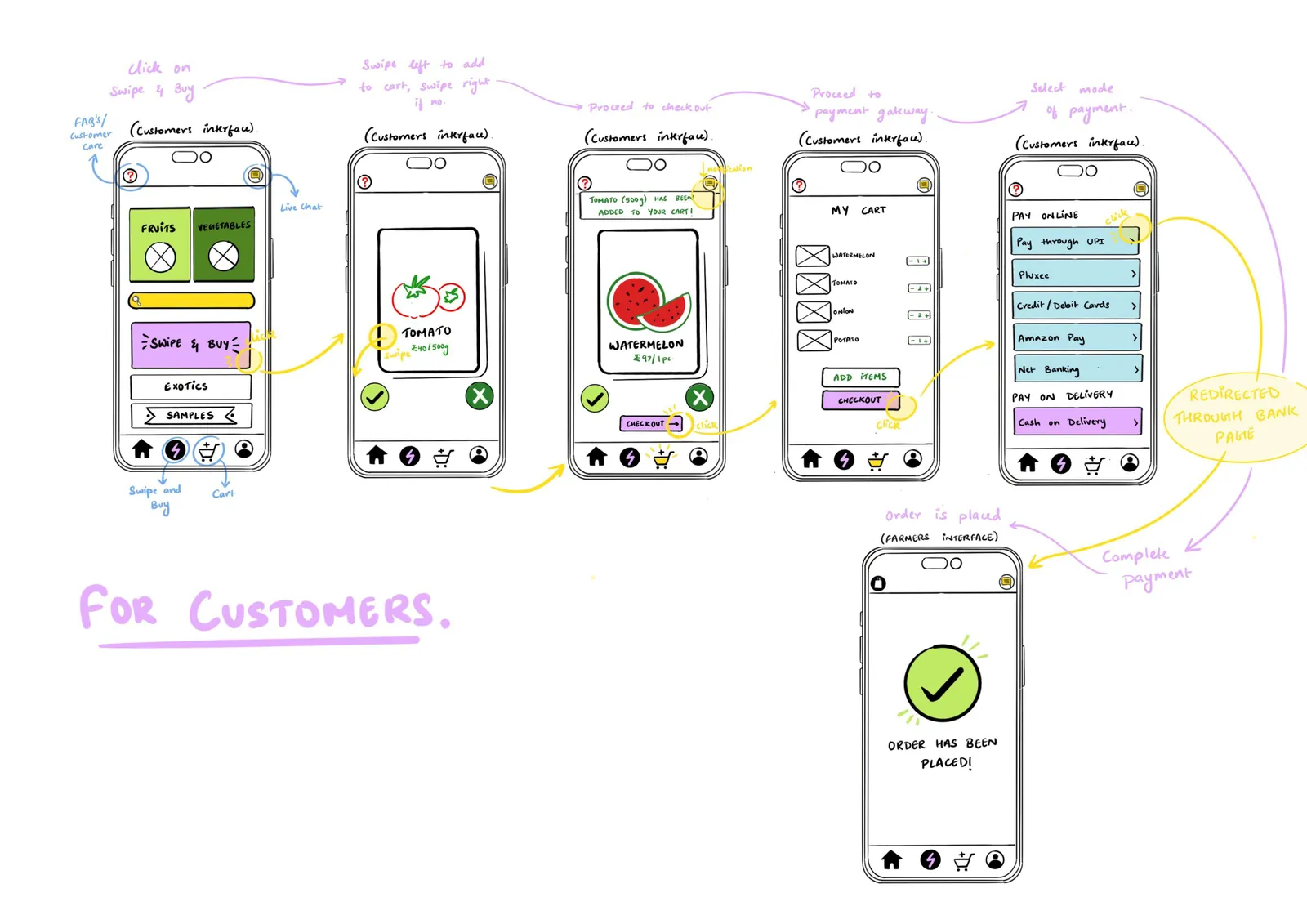
Group wireframes by Dhwani Aggarwal and Harshini Chander.
Down to earth.
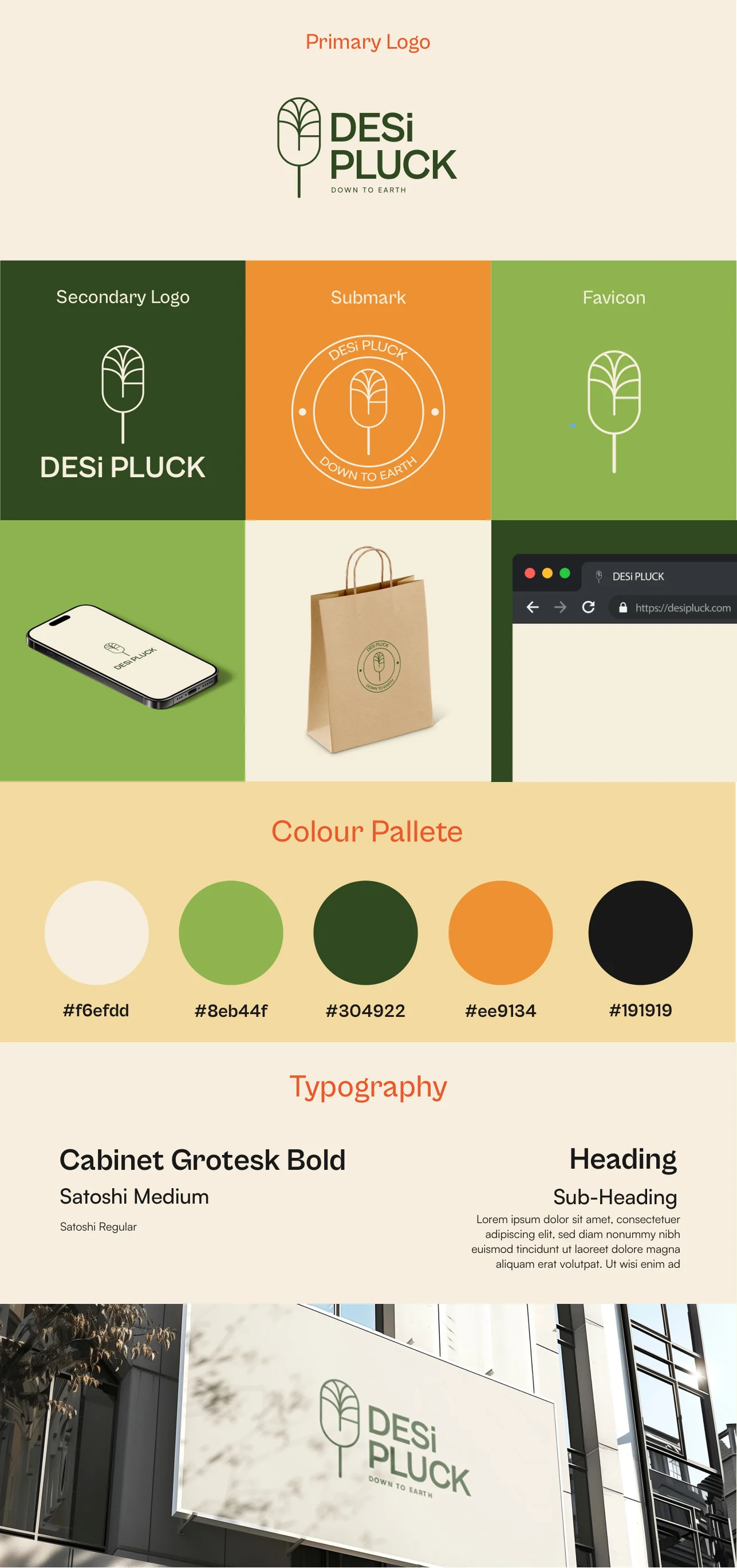
I designed the logo for DESiPLUCK: a tree mark and the line "Down to earth". Beige and greens from the farm, orange for action, Cabinet Grotesk for headings and Satoshi for text.
 Primary logo
 On forest green
 Mark
 Favicon
Down to earth
Down to earth
Three apps in one.
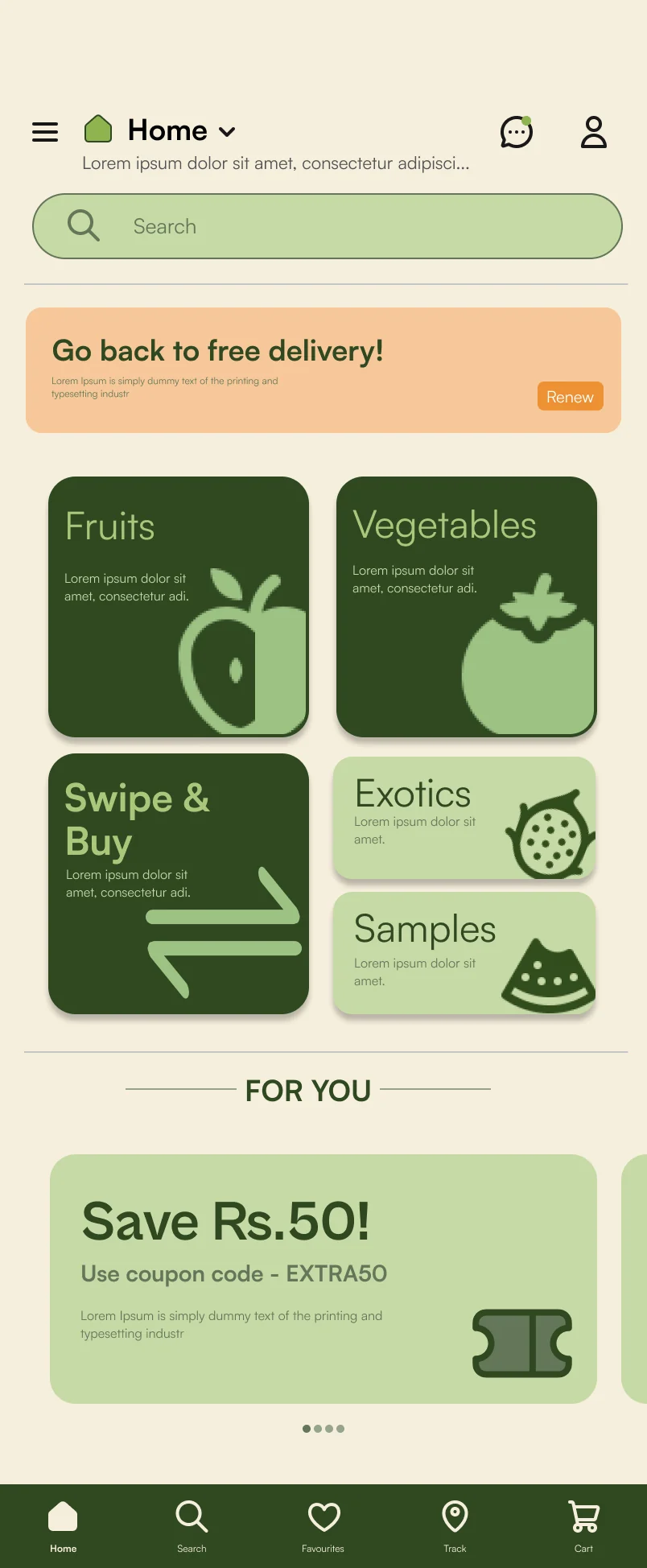
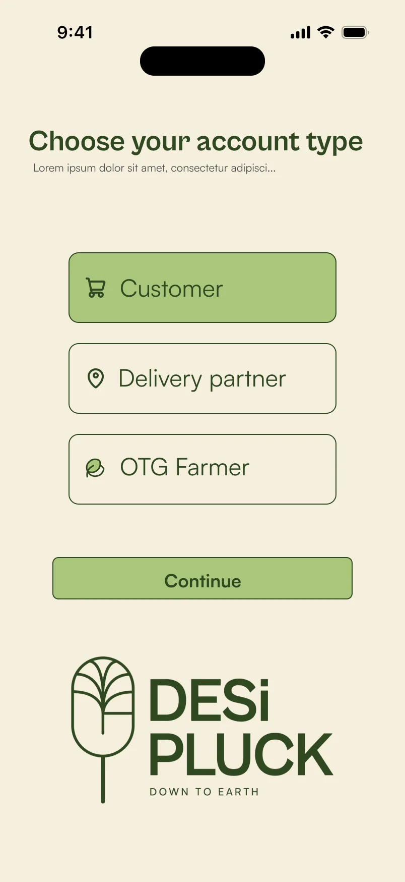
Customers buy, OTG farmers sell, and college students deliver, all in one app with three ways in. My screens were the rewards game and the live chat. Play the game with the real screens:
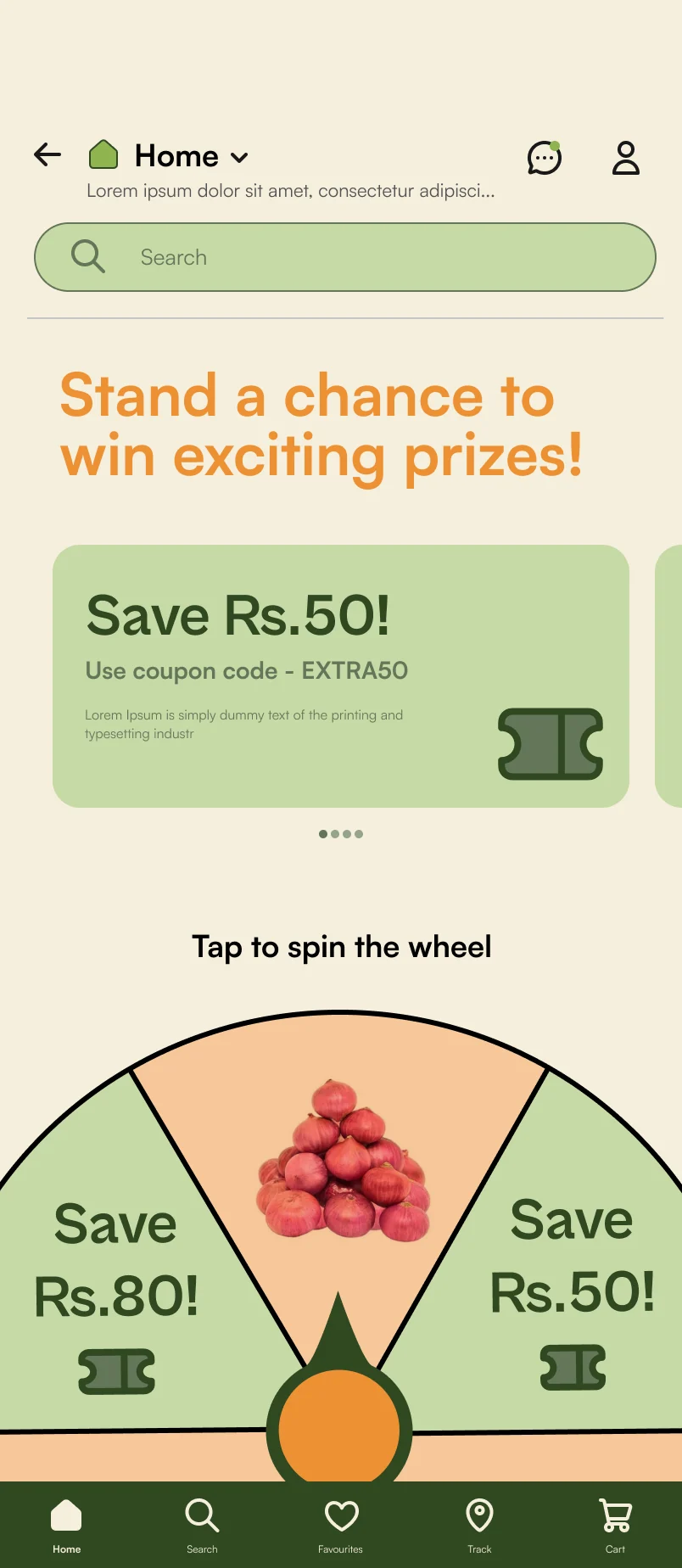
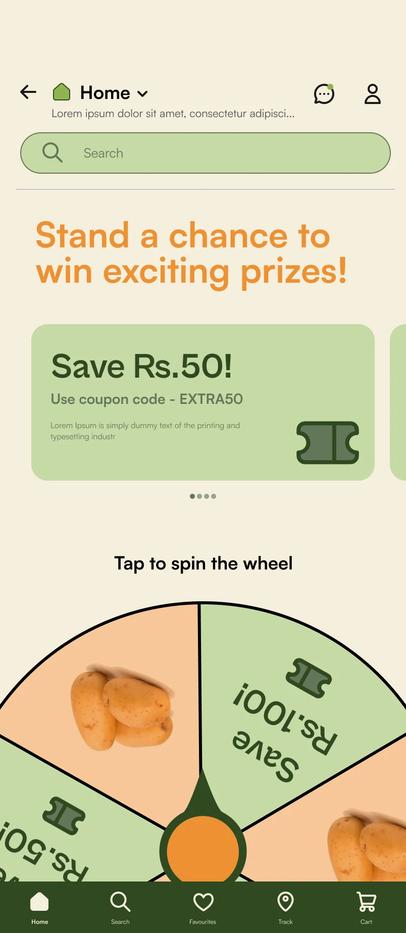
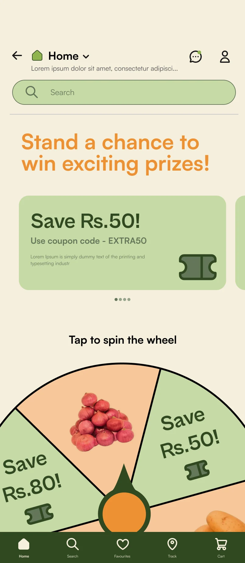
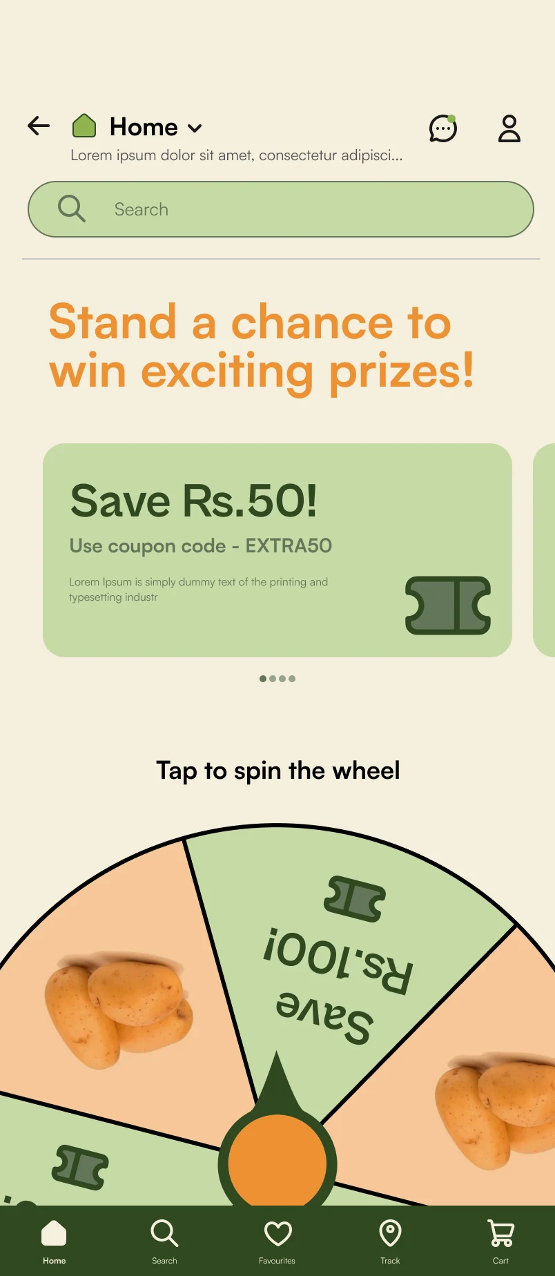
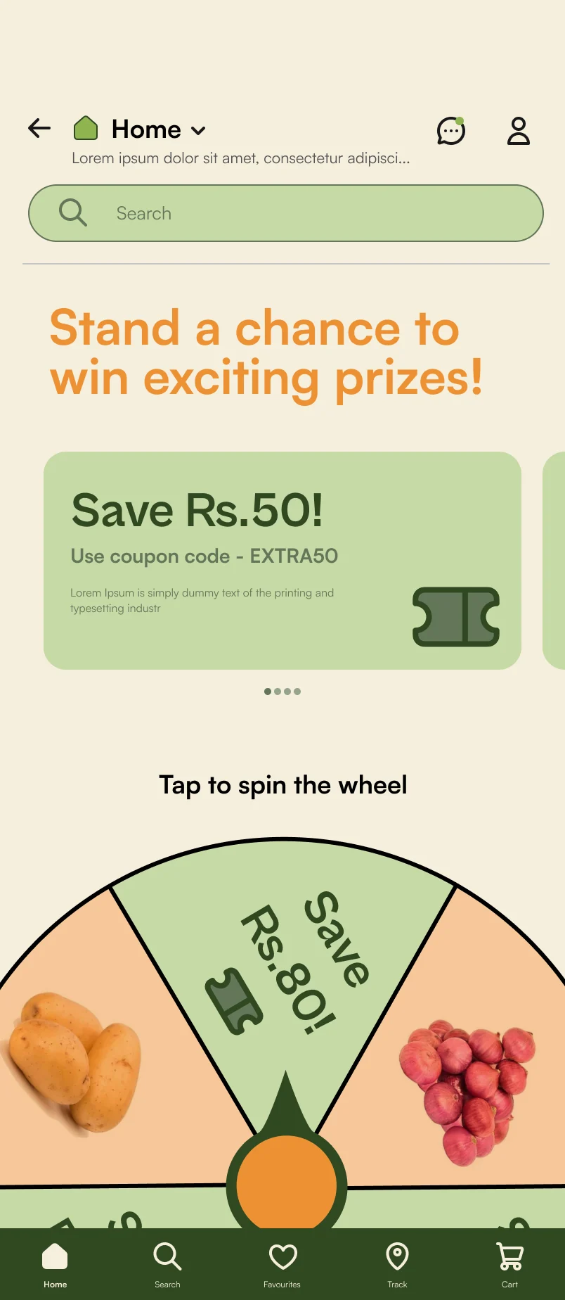
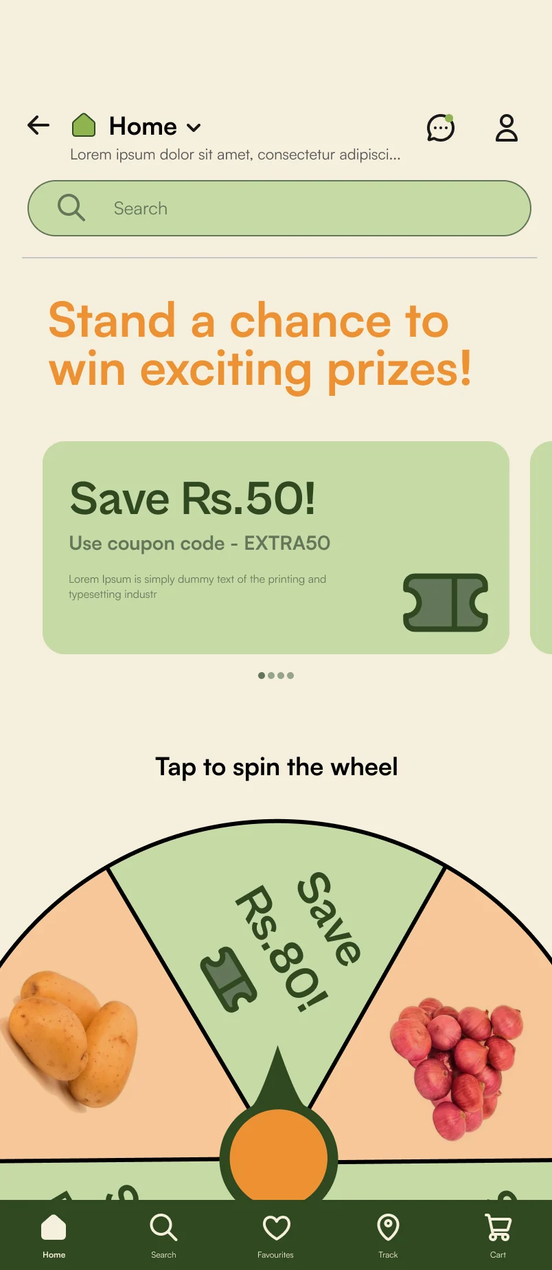
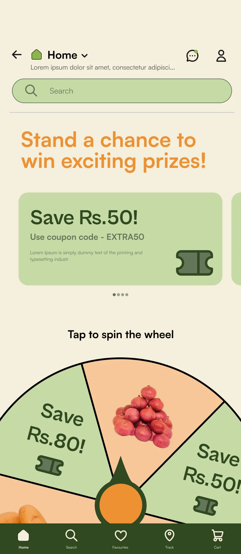
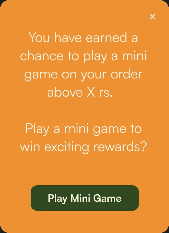
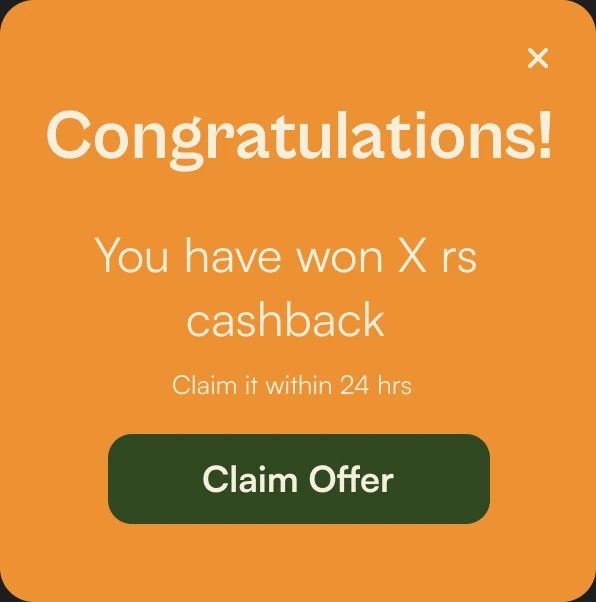
- 1An order above a set amount earns a chance to play.
- 2Tap the wheel to spin it for a reward.
- 3Claim the prize before it runs out.
Seven wheel frames from my Figma file, played in order and slowing down like a real spin.
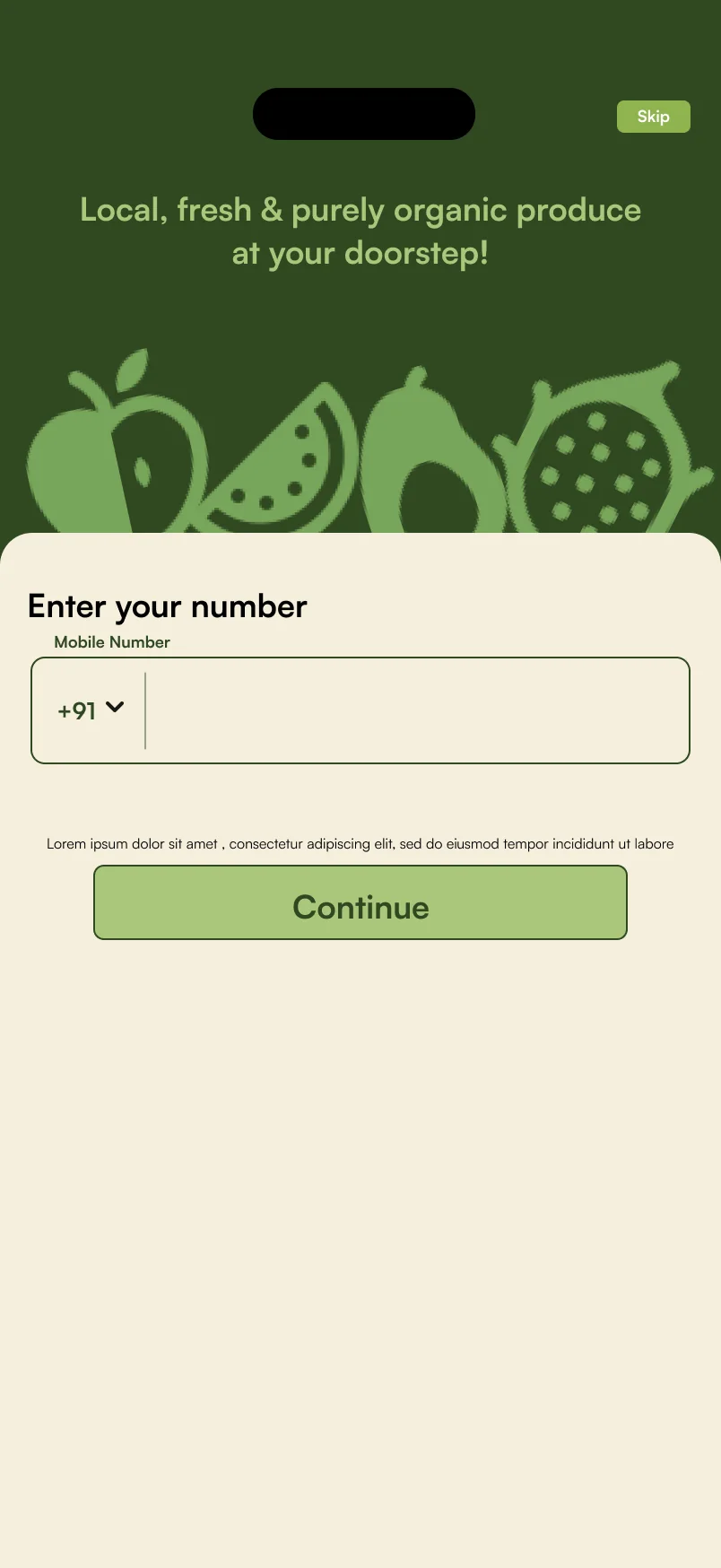
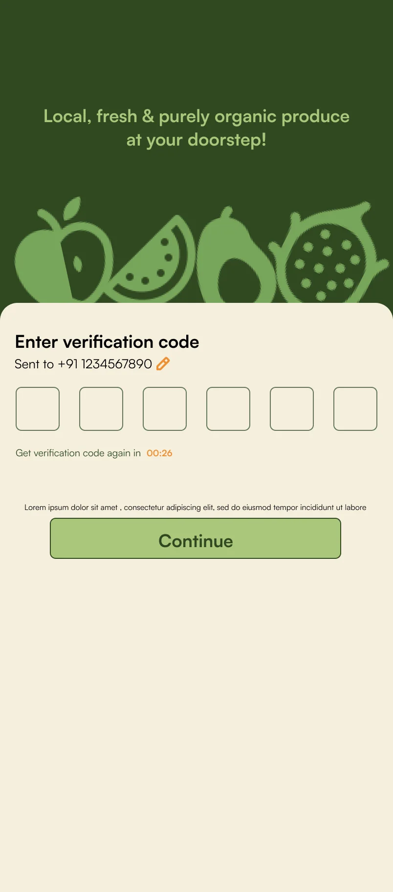
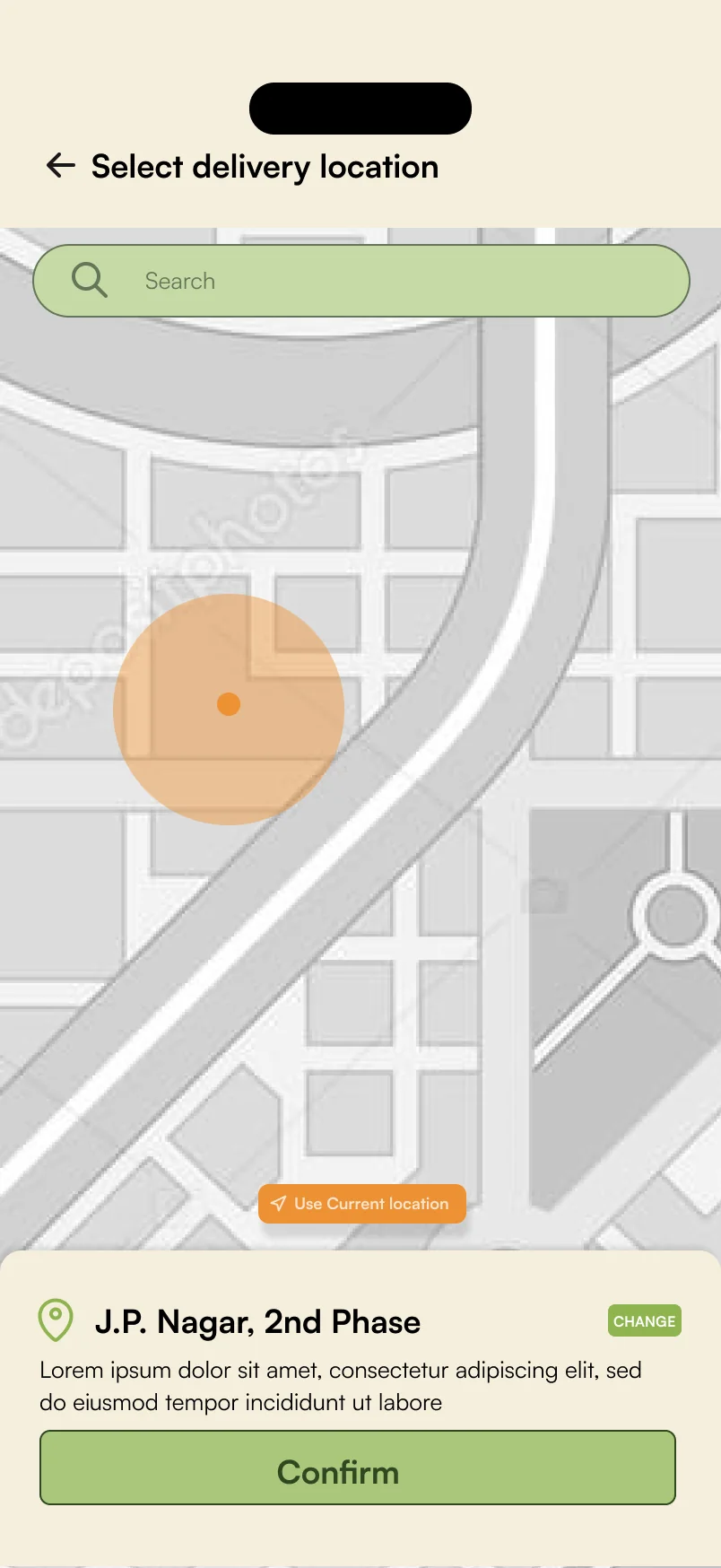
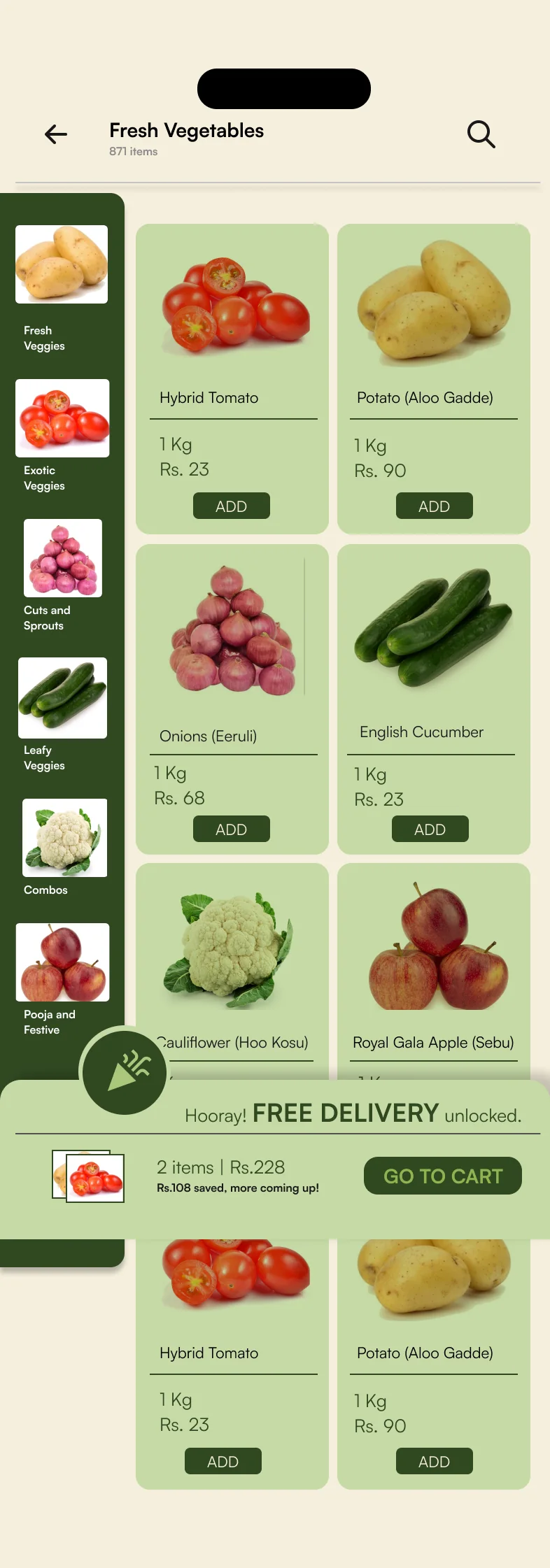
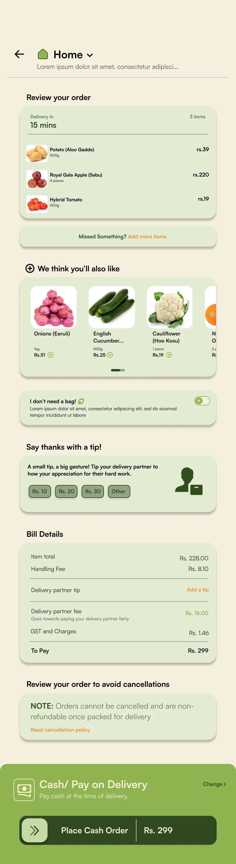
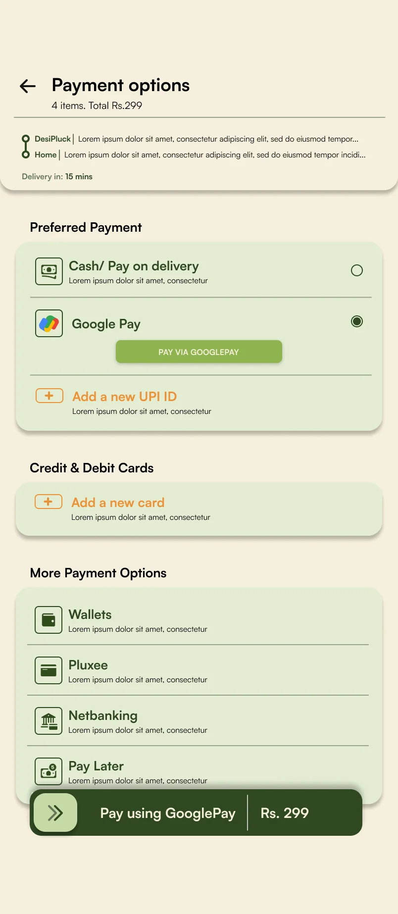
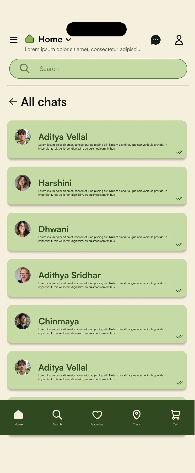
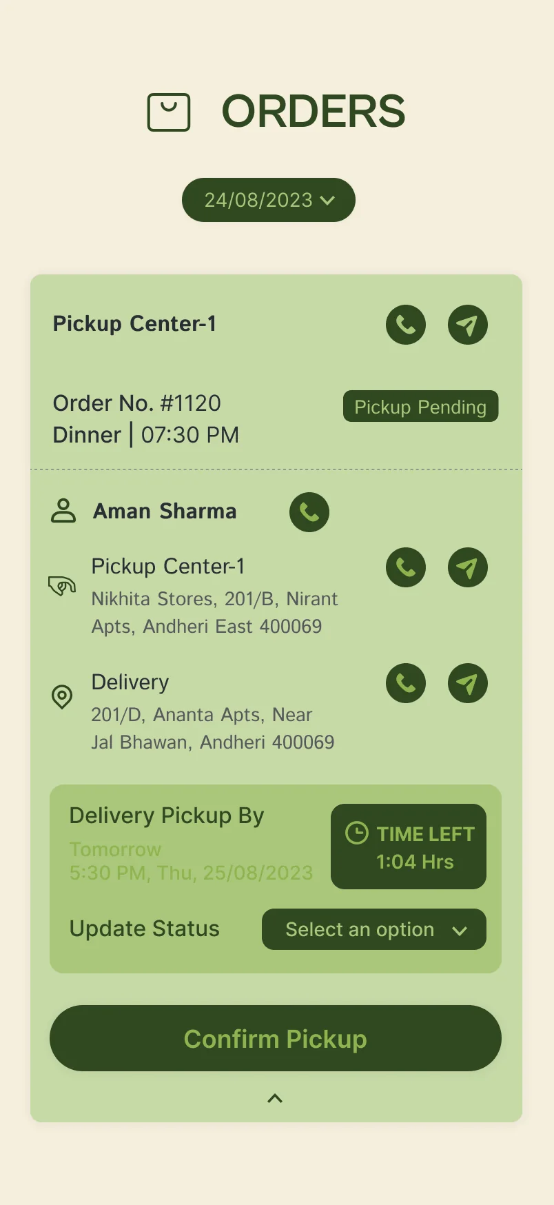
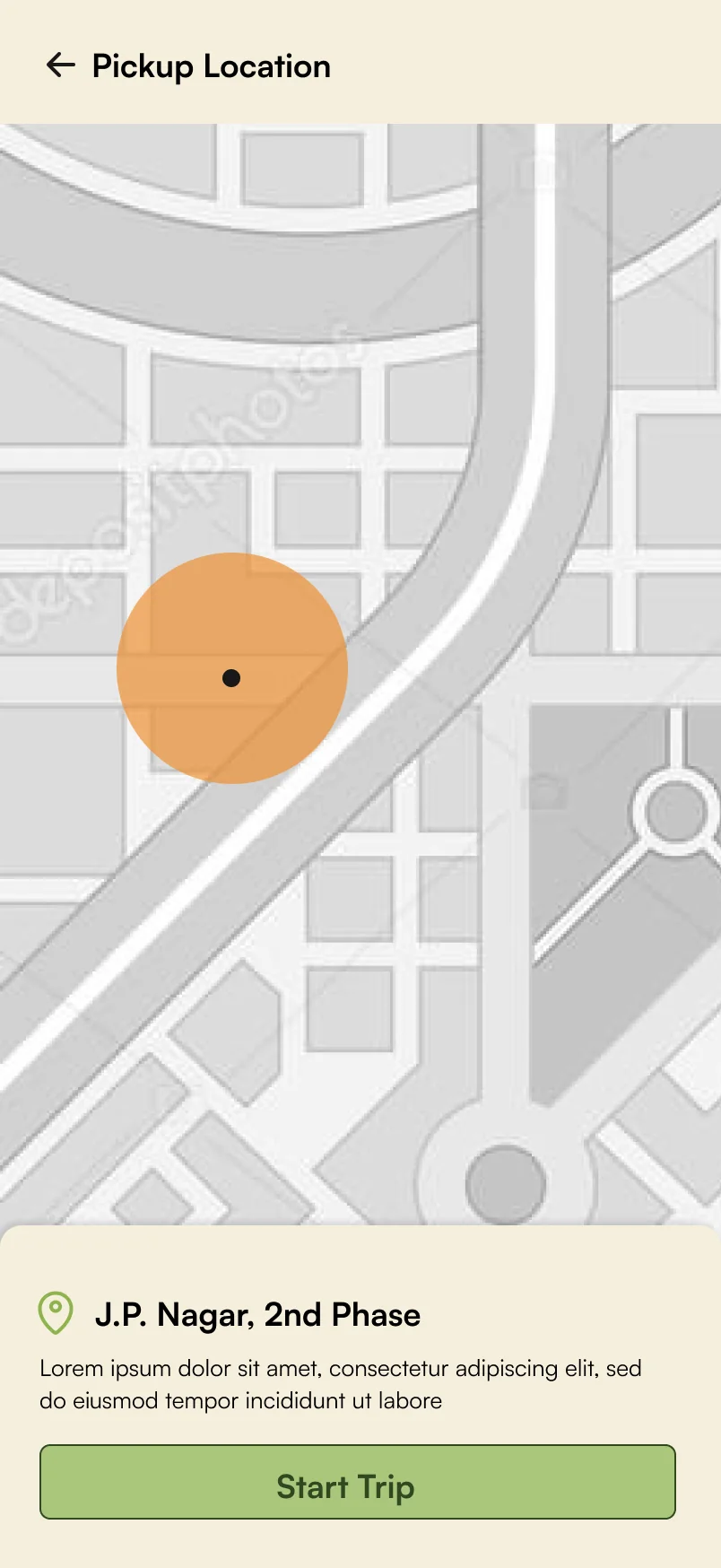
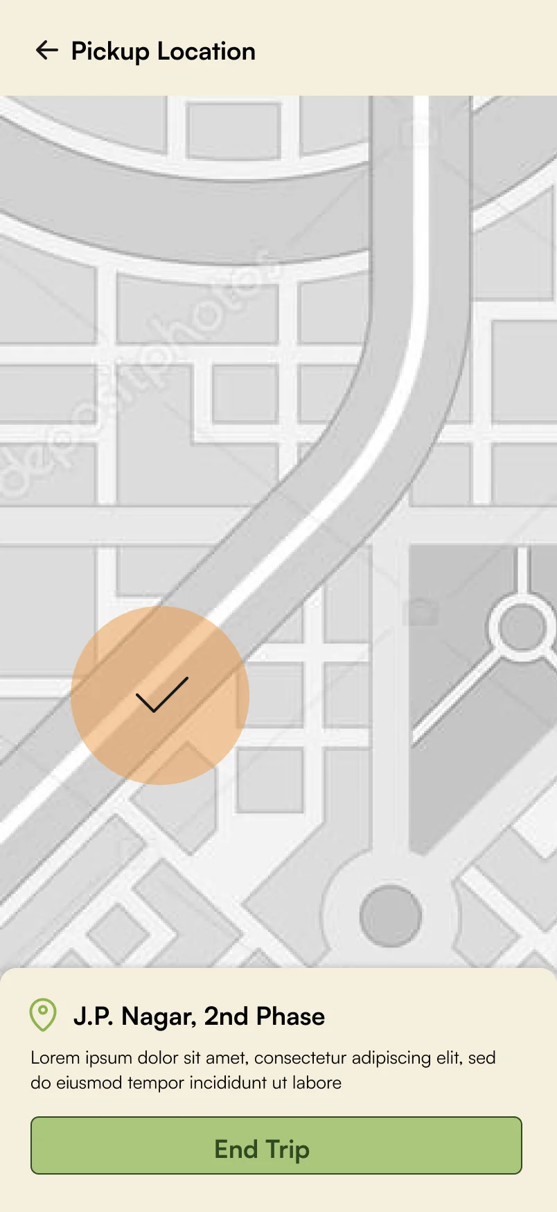
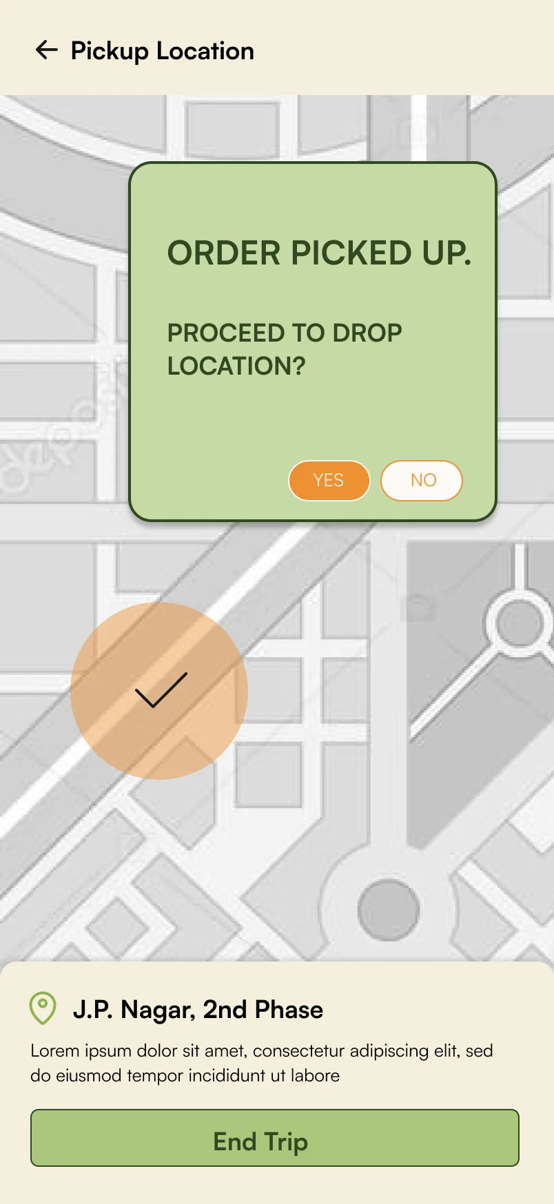
The whole app, tap by tap. These are the final Figma screens from the team, wired up here. Long screens scroll inside the phone.



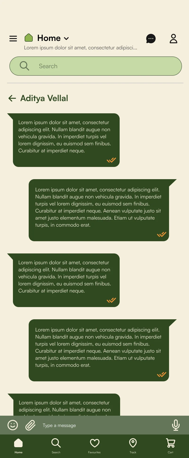
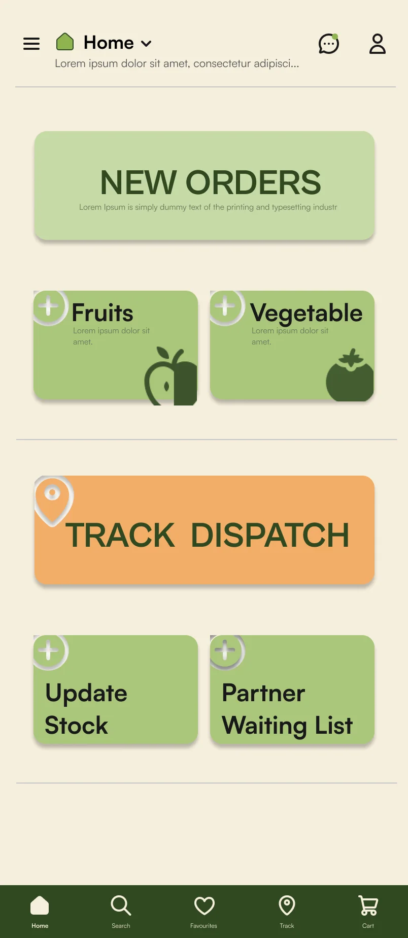
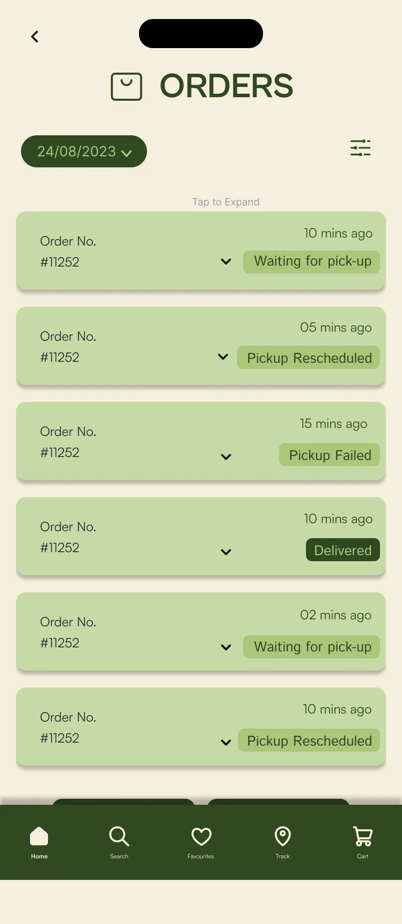
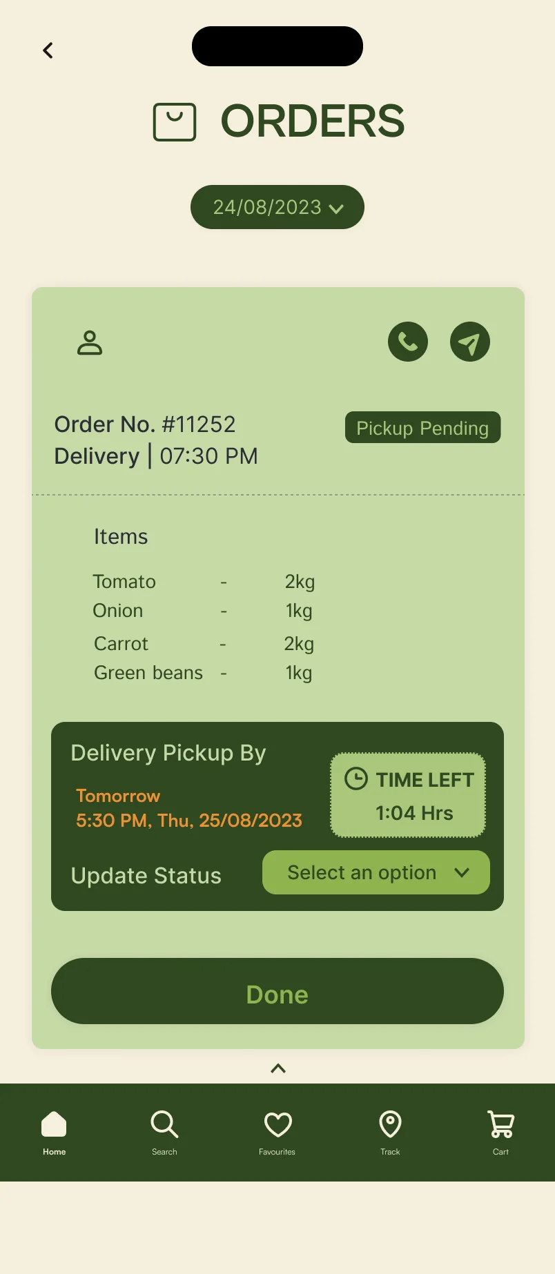
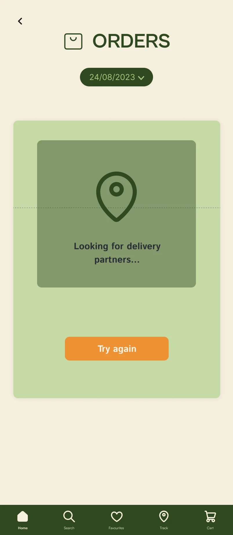
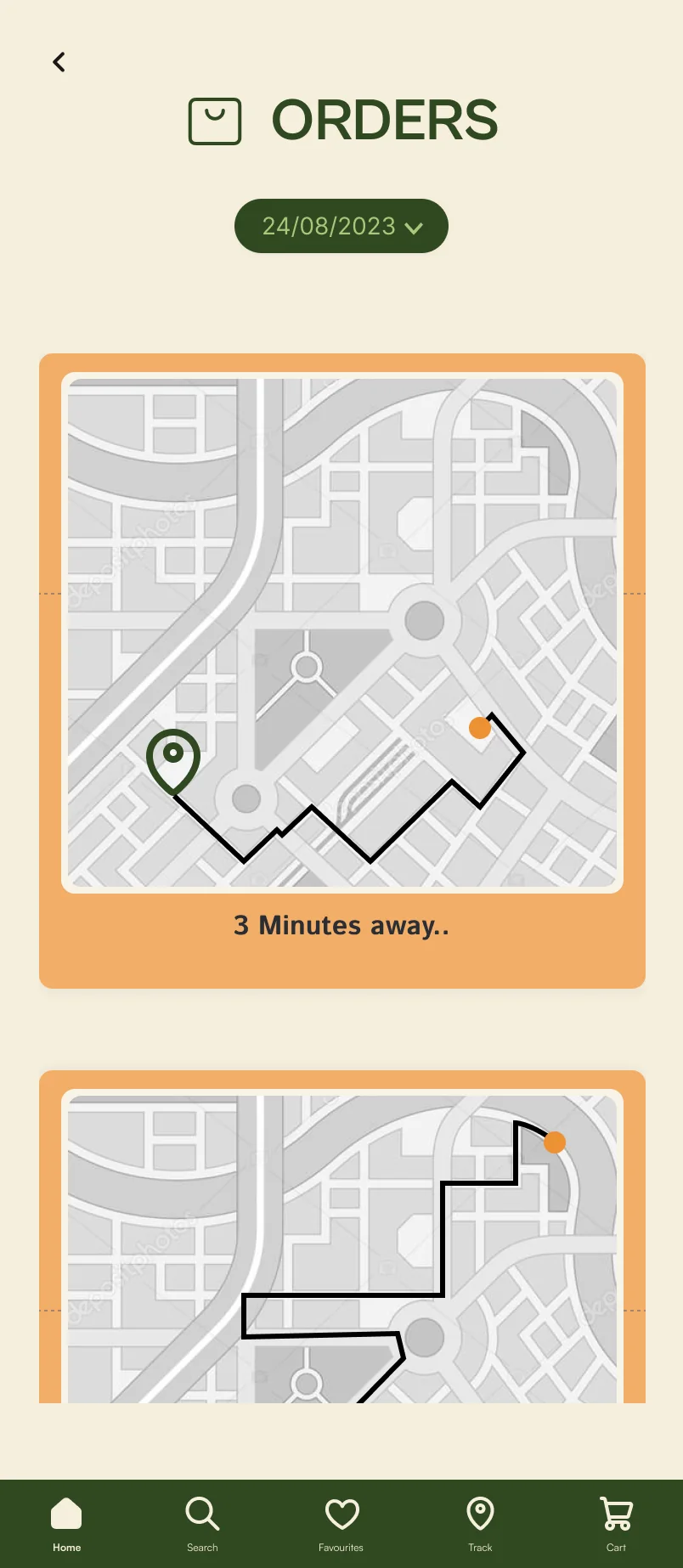
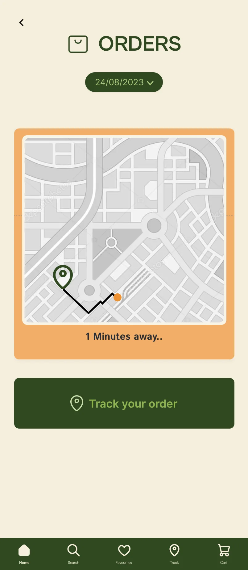
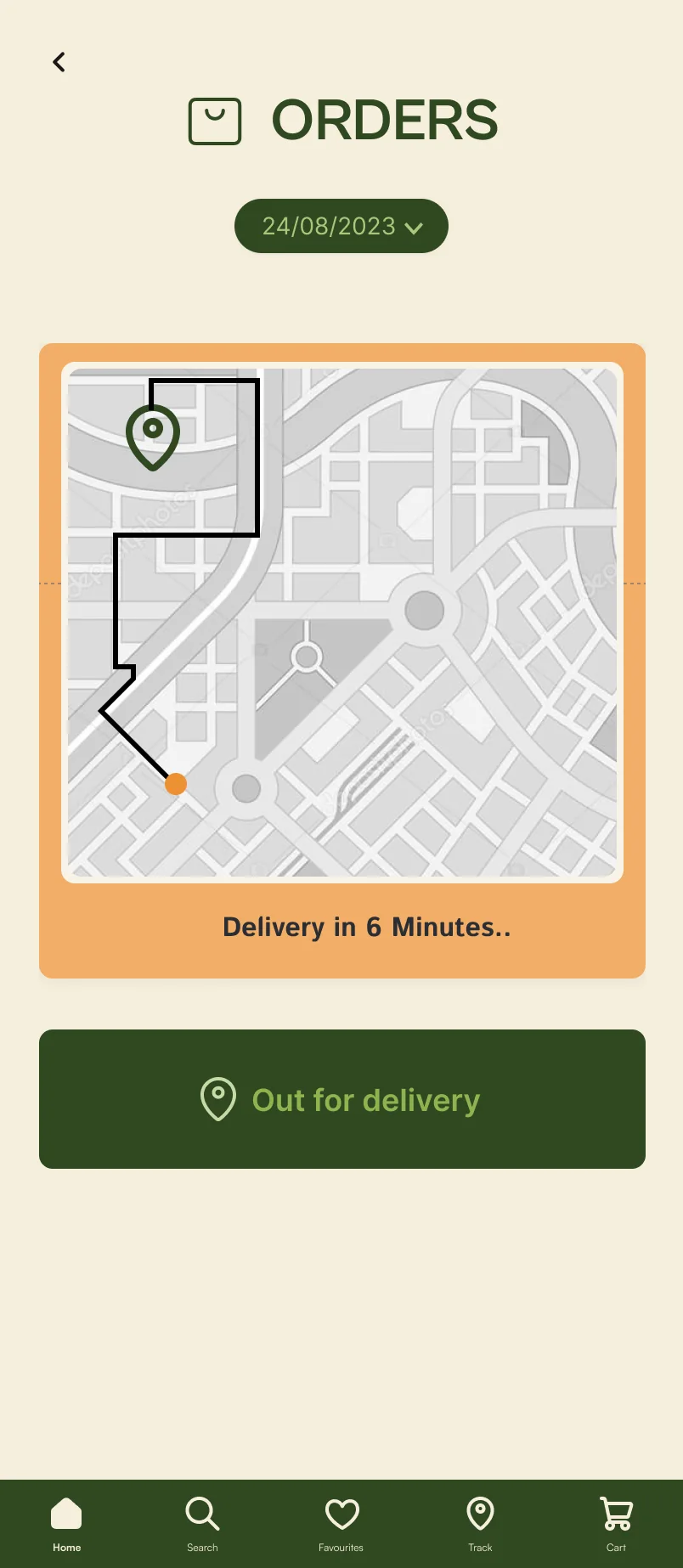
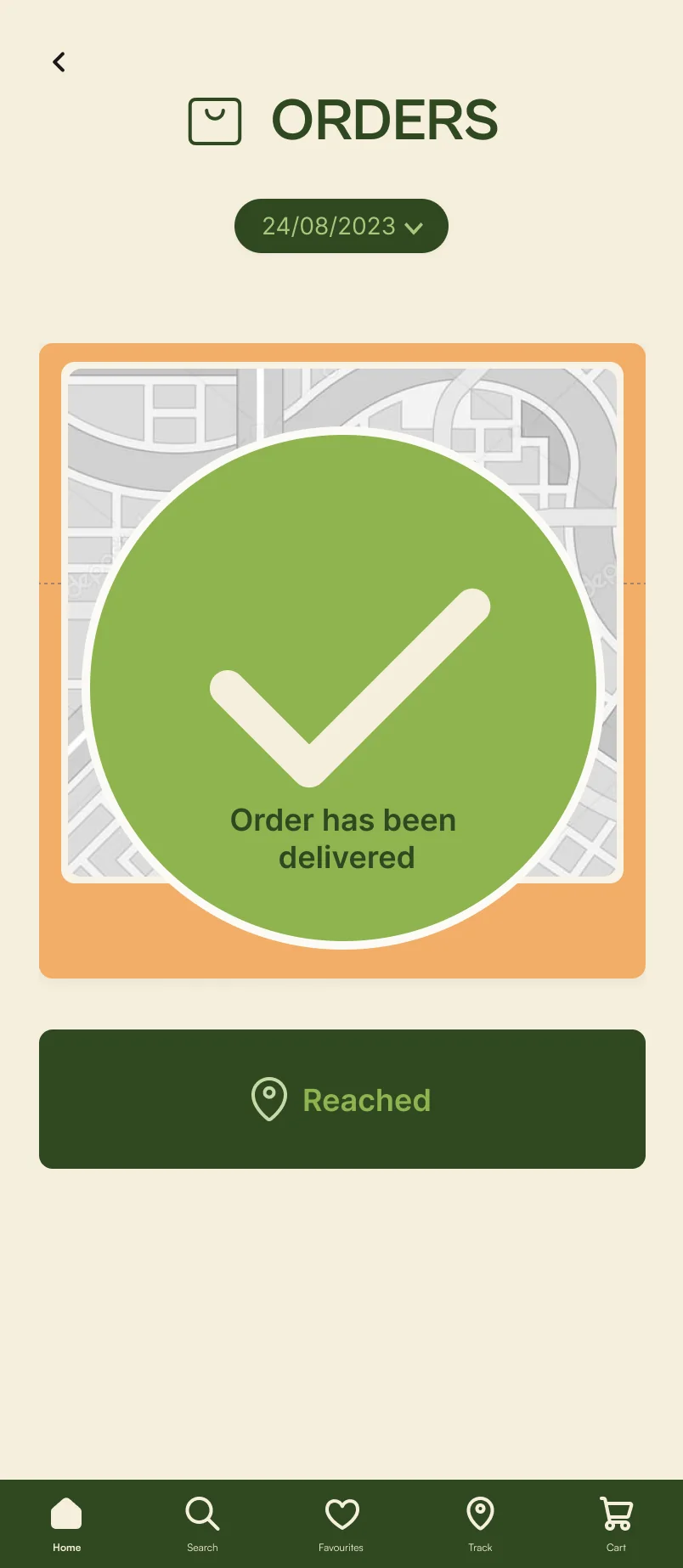
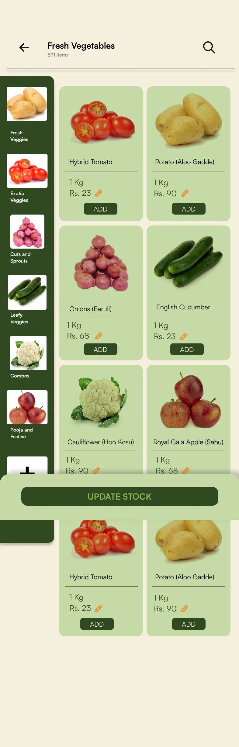
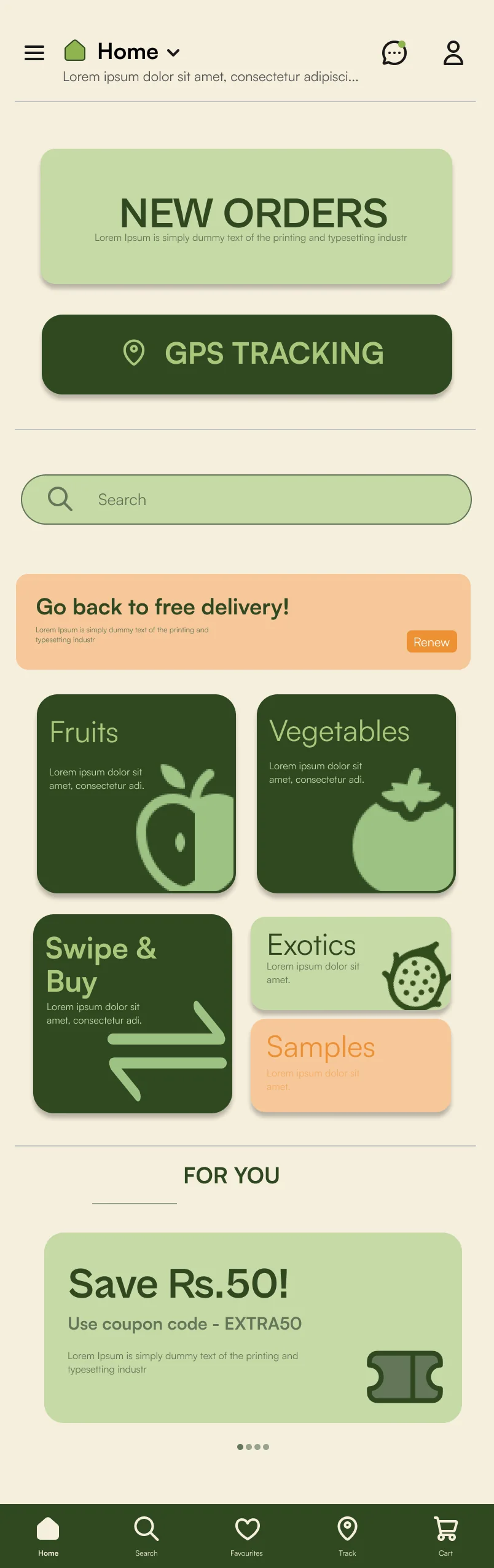
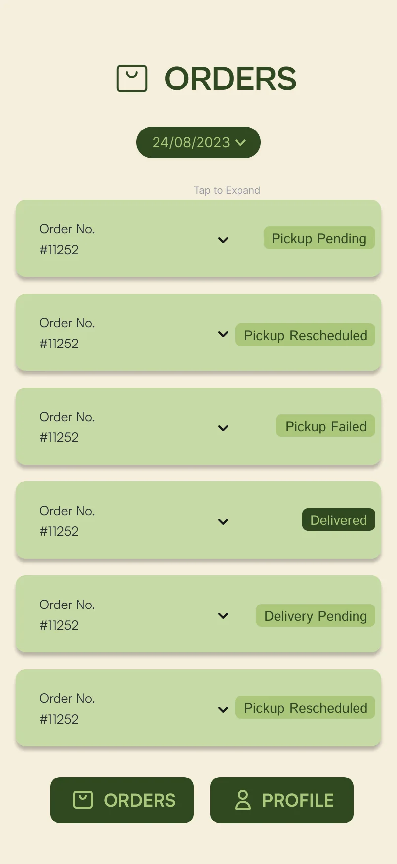
Try it
Sign up, set your address, pick fruit, check out. The chat icon on the home screen opens the live chat with farmers.
See new orders, find a student to deliver one and follow it to the door. Update Stock opens the stock page.
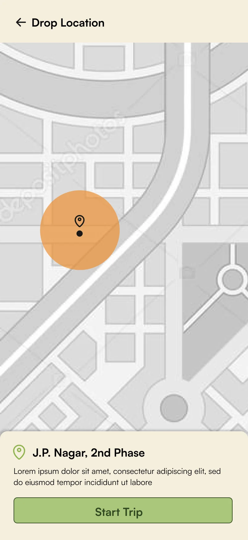
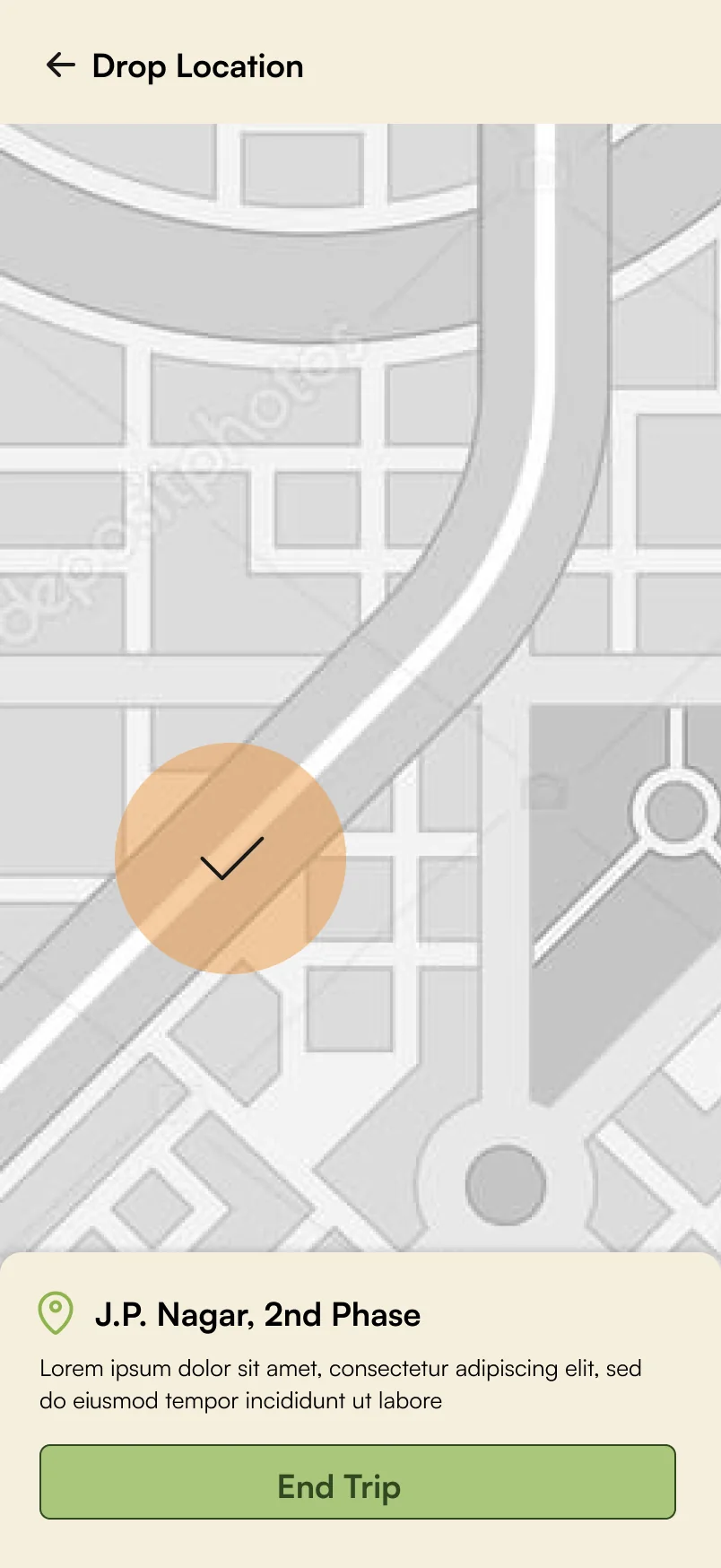
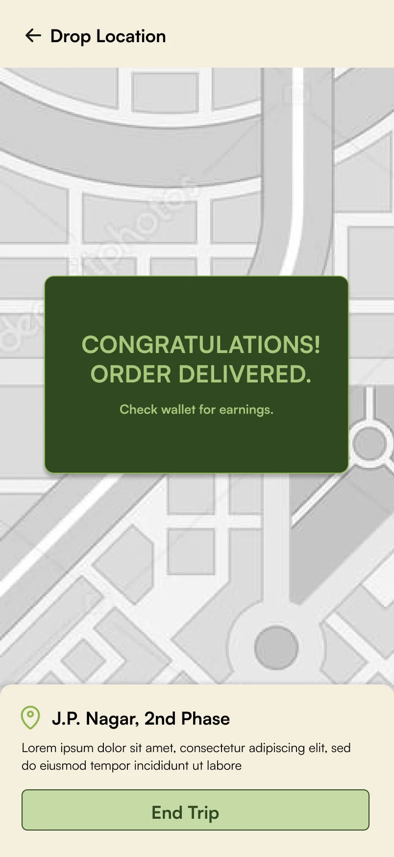
Pick up an order from a farmer and drop it at the customer's door, one step at a time.
Tap where you would in the app. If you get stuck, wait a moment: the next tap lights up, and on long screens the phone scrolls to it.
Swipe & buy.
From the concept sketches: a dating-app-style interface that plays with the customer's psychology and helps increase sales. Swipe right and it goes in the basket.
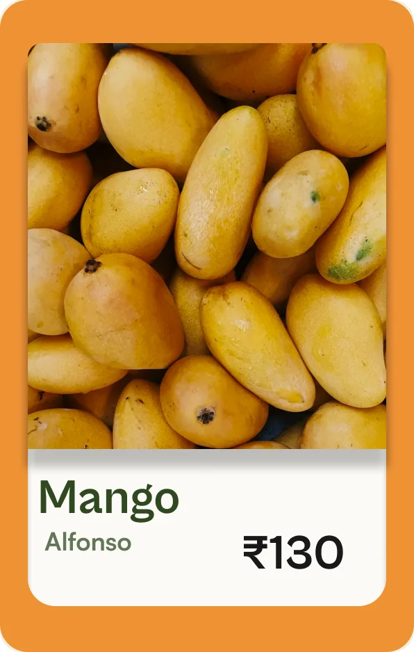
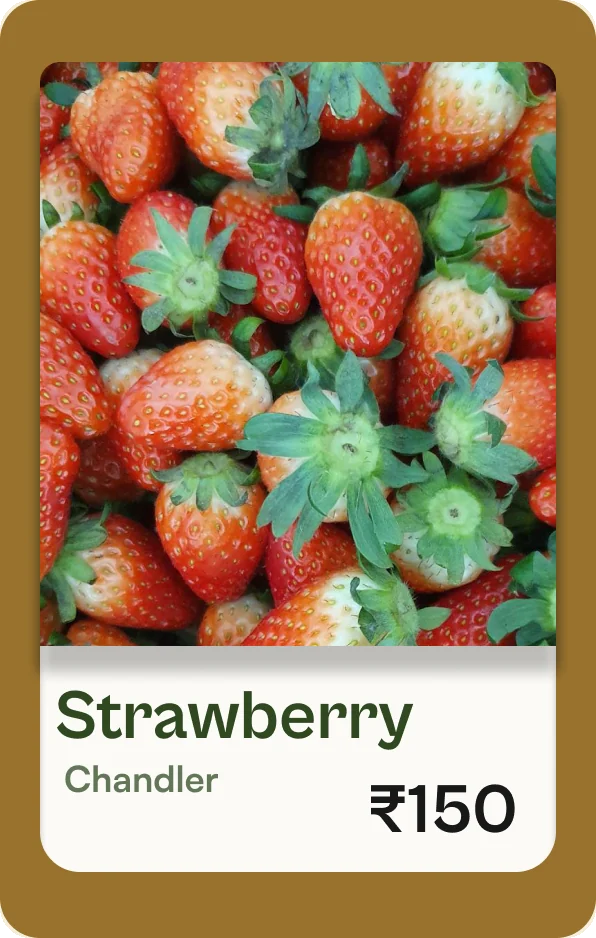
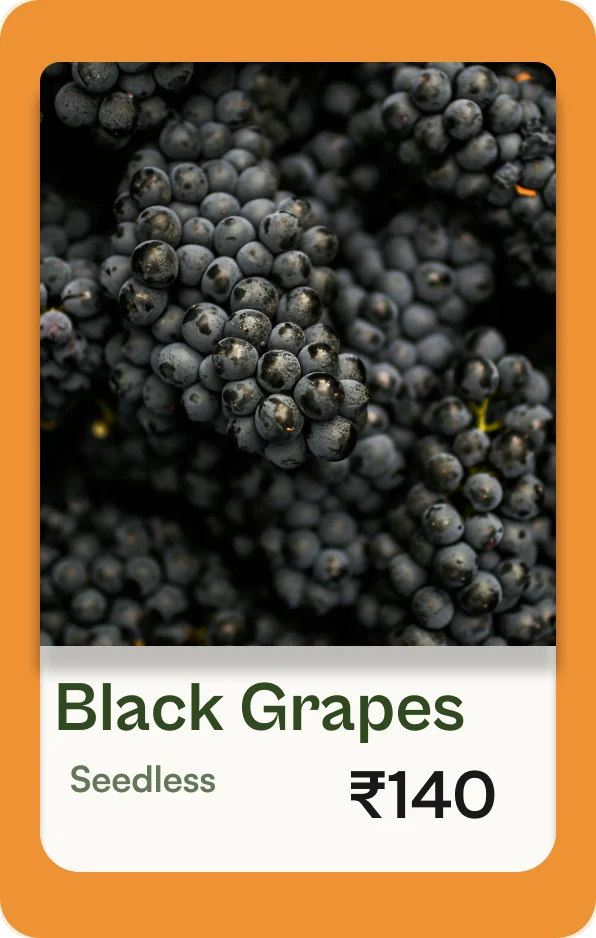
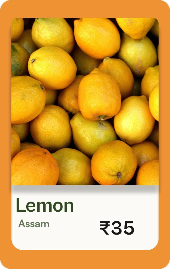
That's today's harvest.
Testing with real people.
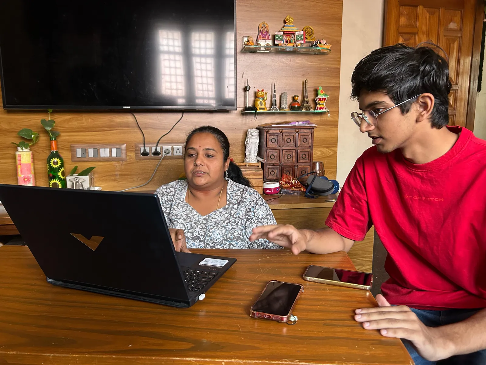
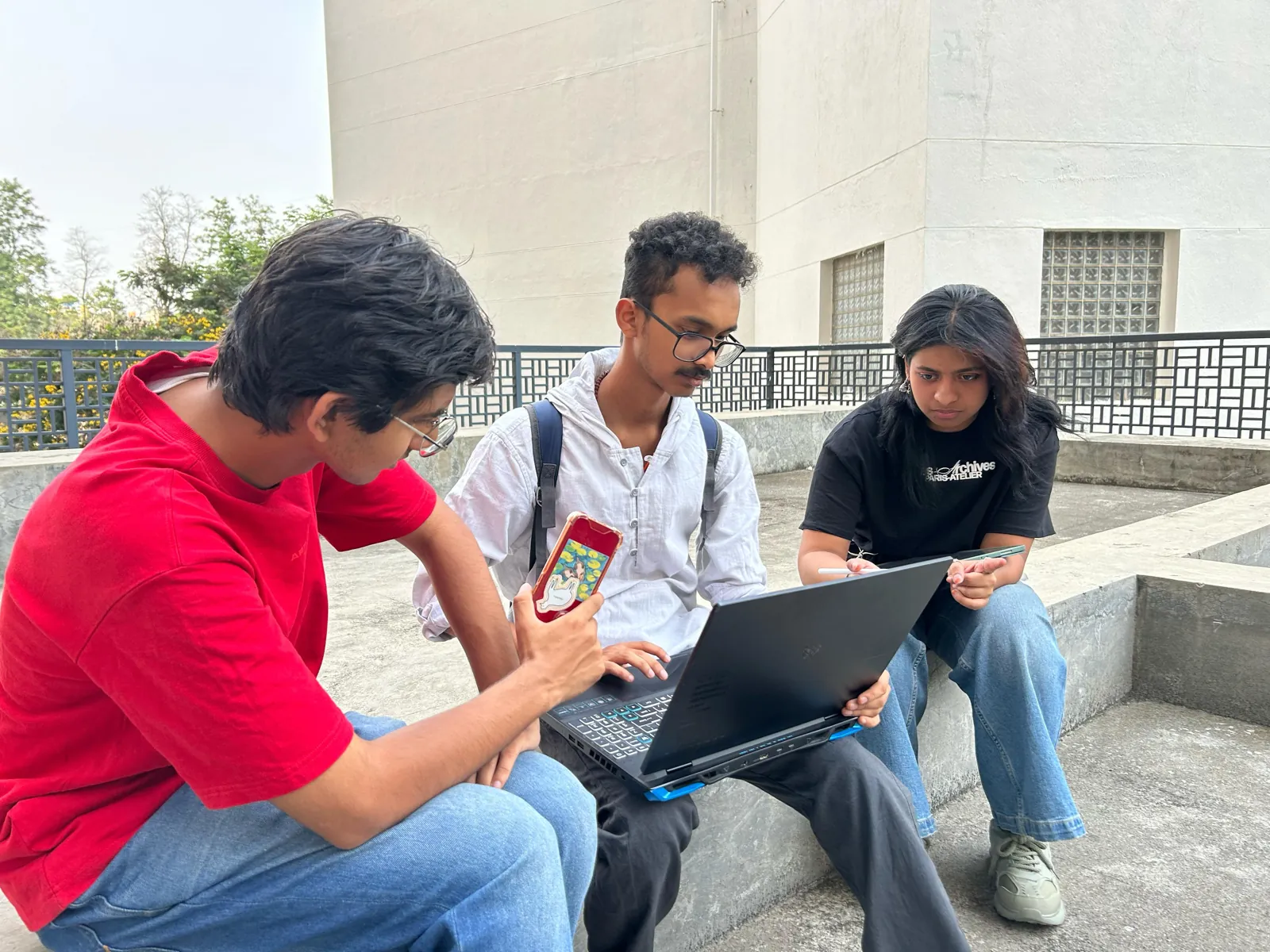
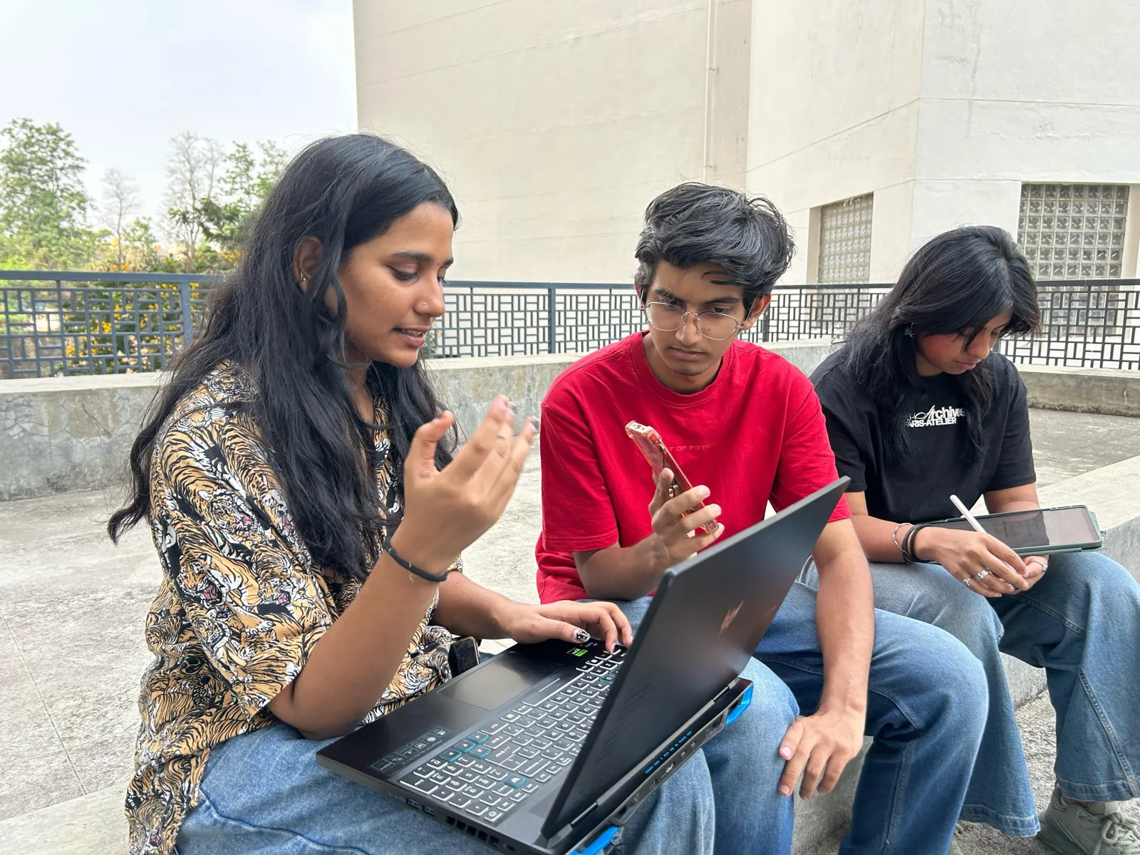
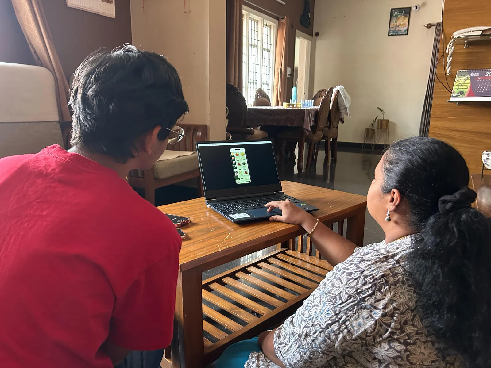
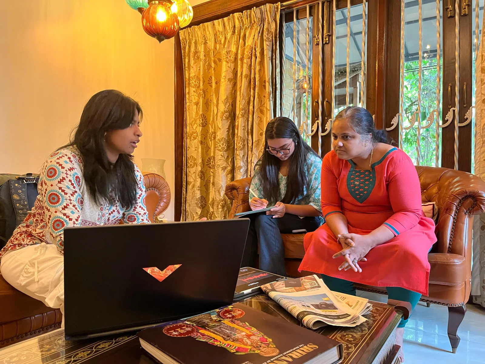
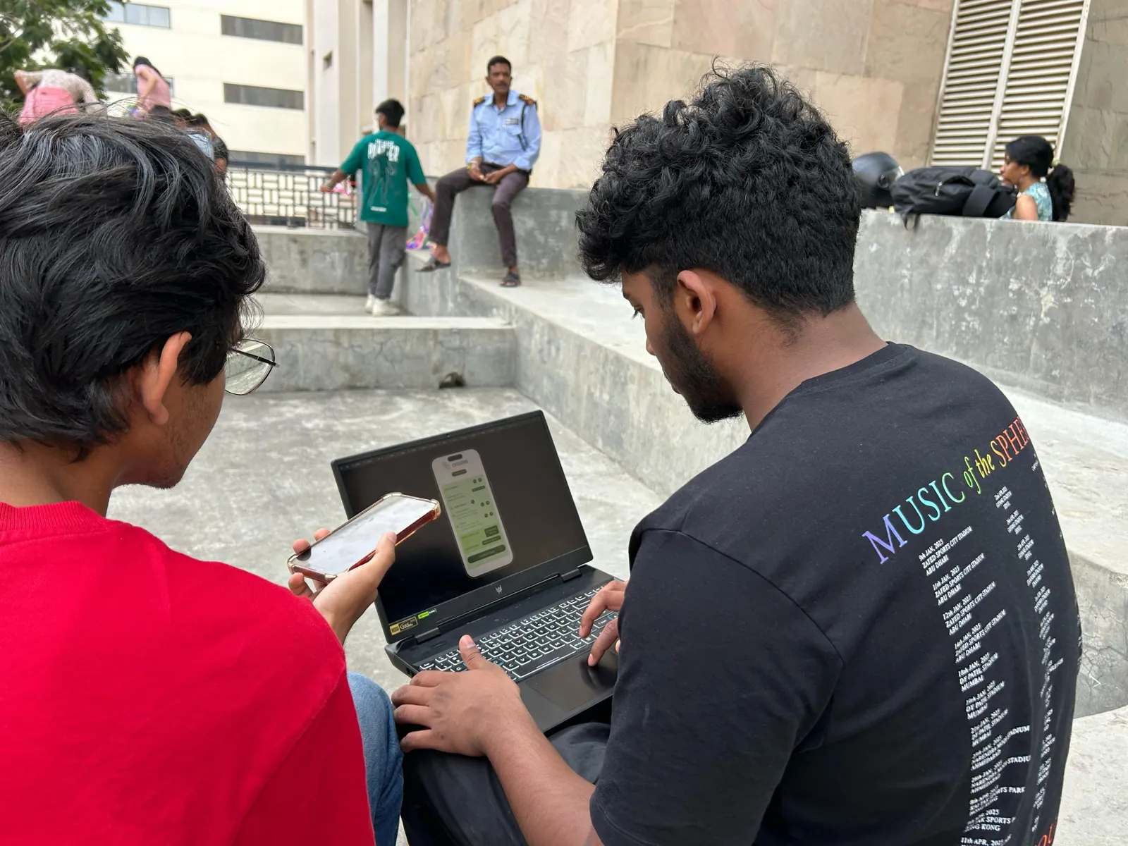
Fifteen people tested the prototype: four OTG farmers from the group, seven customers and four college students as delivery partners. Each took on tasks for their role while we timed them and noted every slip.
Farmers
- Preeti, 45
- Srikanth, 49
- Srilakshmi, 46
- Savitha, 47
- Register as a farmer85%
Unsure how to move on after picking a profile type.
- View incoming orders85%
Found New Orders almost instantly.
- Check monthly sales85%
Pleasantly surprised by the graphs; one wanted more detail.
- Chat with customers72%
The live chat icon was a little too small to spot.
- Confirm an order for delivery72%
A long list of orders felt overwhelming at first.
- Set pricing and availability70%
Missed the pencil icon for editing prices.
- Add products to the catalogue65%
Tapped the photo instead of the Add button.
A feature to show what stock will be available next week, so customers can pre-order.
Preeti, farmerEverything could easily be done on one page instead of multiple pages.
A farmer, on updating stock
Customers
- Ravishankar, 47
- Lakshmi, 50
- Smitha, 45
- Jaya, 46
- Gagan, 27
- Sumit, 28
- Rishan, 20
- Contact support about an order91%
- Add to cart, review and place an order91%
- Browse and find a specific item91%
- Order with Swipe & Buy83%
Took a moment to understand, then it clicked.
- Sign up and set up a profile76%
- Play a mini-game for a discount70%
- Confirm an order and track delivery65%
Since I'm in IT, gamification is what drives new customers nowadays.
A customer, on Swipe & BuyThe chatbox was at the top of the home page, so it was easy to find.
A customer
Student partners
- Arnav, 19
- Jahnavi, 19
- Mahin, 20
- Jyotsana, 19
This feels just like Swiggy, the tracking interface and all.
A student partnerThis is very clean, I can sign up so quickly!
A student partnerThere is no filter option here. How will I select close deliveries or higher-paid deliveries?
A student partnerCan I take a photo instead of uploading?
A student partner, at the document step
Success rates are the team's averages, weighted by how closely each person matched the role. Student partners did five tasks each and finished almost all of them, so their side is told in their words.
Reading the results.
For every task we logged the success rate (weighted by how well each person fit the role), errors, time, how easy it felt and how frustrating it was. Sort any column to find the weak spots.
| Task | |||||
|---|---|---|---|---|---|
| Register as a farmer | 85% | 1 | 5.35 min | 9.75 | 0 |
| View incoming orders | 85% | 0 | 1 min | 10 | 0 |
| Chat with customers | 72% | 1 | 1.8 min | 8.5 | 2 |
| Confirm an order for delivery | 72% | 2 | 7 min | 8 | 2.5 |
| Set pricing and availability | 70% | 2 | 3.9 min | 9.5 | 0.25 |
| Check monthly sales | 85% | 0 | 2.5 min | 9.5 | 0 |
| Add products to the catalogue | 65% | 3 | 7.3 min | 8.25 | 1.75 |
Errors are counted across all four farmers. Most were navigation slips: not knowing to press Continue, or missing the pencil icon.
| Task | ||
|---|---|---|
| Sign up and set up a profile | 76% | 0 |
| Contact support about an order | 91% | 0 |
| Add to cart, review and place an order | 91% | 3 |
| Confirm an order and track delivery | 65% | 0 |
| Play a mini-game for a discount | 70% | 1 |
| Browse and find a specific item | 91% | 0 |
| Order with Swipe & Buy | 83% | 2 |
Time, ease and frustration for customers weren't recorded separately in our sheet, so only success and errors are shown.
What people liked
- The colour scheme
- A clean layout and consistent spacing
- Quick, responsive screens
- Profile customisation
- Everything for stock on one page
What needs work
- Navigation and unclear calls to action
- Small text and small icons
- Buttons that looked inconsistent
- Form layouts
- Pay per delivery, filters, and dark mode
Telling the story.
For the final submission I compiled the project into a Behance case study, then storyboarded and animated its slides.
My part.
- Connected
Brought the team to the OTG farmers, who I know, for interviews and testing.
- Researched
The questionnaire, interviews and product research with the team.
- Mapped
The live chat and mini-game flows, then their wireframes.
- Sorted
Four card-sorting sessions, from a 12-year-old to a 79-year-old.
- Branded
The logo and much of the visual identity.
- Prototyped
Wired the screens into the prototype we tested.
- Presented
Every deck, and the Behance case study: I compiled it, storyboarded the slides and animated them.
Aditya Vellal (me), Chinmaya M Hebbale, Dhwani Aggarwal, Harshini Chander and Adithya Sridhar.
- Let farmers post next week's stock so customers can pre-order.
- Give student partners filters for nearby or better-paid deliveries, and show pay per delivery.
- Make the live chat icon and the edit-price button easier to find.